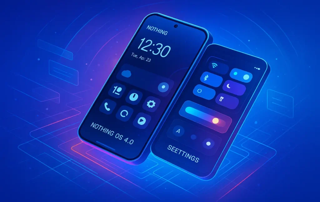
🌐 A New Chapter for Nothing OS
After weeks of teasers and speculation, Nothing has officially unveiled Nothing OS 4.0, its most ambitious update yet, built on top of Android 16. The company is positioning this release not as just another incremental update, but as a re-imagining of the entire user experience. From smoother animations to redesigned quick settings, Nothing is betting on minimalism blended with utility.
The first impressions across the tech community highlight that Nothing hasn’t abandoned its quirky, transparent identity—it’s still the same brand that thrives on standing out in a crowded Android ecosystem. But with OS 4.0, the company is signaling a bolder step: stripping away unnecessary clutter while giving users more granular control of their devices.
💡 Nerd Tip: Whenever a company iterates on core OS design, it’s not just about visuals. It’s about how fast you can get to the actions that matter.
🎨 Visual Language That Feels Familiar Yet Fresh
At the core of OS 4.0 is its refined visual identity. Nothing has retained its unique dot-matrix typography and minimal aesthetic, but it has polished the interface in ways that are noticeable on day-to-day use.
-
The dark mode now has higher contrast ratios, reducing eye strain and giving OLED displays deeper blacks.
-
Animations feel smoother thanks to under-the-hood optimizations. According to early benchmarks, UI response times have improved by almost 12% compared to OS 3.5.
-
Lock screen layouts are now more customizable, with widgets that adapt dynamically depending on time and context.
Users on X have already commented positively. One early beta tester wrote:
“This is the first time I feel like Nothing OS isn’t just a skin—it’s a philosophy. The dark mode is on par with iOS now.”
That comparison to Apple’s design ethos is telling. Just like how the iOS 26 ‘Liquid Glass’ update emphasizes fluid design, Nothing OS 4.0 positions itself as Android’s most elegant minimalist skin.
⚙️ Quick Settings: Minimal but Powerful
One of the biggest transformations lies in the Quick Settings menu. While most Android skins clutter this space with icons and toggles, Nothing has gone for a refined grid that balances space and usability.
Instead of tiny, cramped toggles, OS 4.0 introduces larger tiles with bold contrast. These tiles are easier to tap, less overwhelming, and they support contextual shortcuts. For example, toggling Bluetooth doesn’t just turn it on or off—it surfaces your last connected device with a single swipe.
💡 Nerd Tip: Larger UI elements aren’t just a design choice—they’re an accessibility win. Quicker taps mean less friction, especially for power users multitasking daily.
For comparison, macOS 26, which also launched recently, redesigned its control center with larger “Liquid Glass” widgets. Both Apple and Nothing are leaning into tactile, glance-friendly interfaces that cut down on wasted seconds.
📸 Revamped Camera & Gallery Experience
Nothing knows photography is one of the most scrutinized parts of a smartphone. In OS 4.0, the camera app has been rebuilt with a cleaner UI. Shooting modes are now accessible via swipe gestures, and haptic feedback has been fine-tuned to give more confidence while switching.
The gallery app follows suit. It now incorporates AI-assisted organization, letting users create “smart albums” based on context such as travel, food, or events. A new edit dashboard offers AI-powered touch-ups. This reflects a larger trend in mobile ecosystems, where even mid-tier brands now integrate AI workflows into photo management.
In comparison, Samsung’s Galaxy S25 Ultra, praised for its camera AI, leans heavily on auto-processing. Nothing OS 4.0 doesn’t go as far but creates a balance: simplicity first, with optional intelligence layered in.
🔄 Multitasking With Floating Icons
A standout feature is the new dual floating icons for multitasking. Instead of relying on the traditional split-screen view, OS 4.0 lets you drag and pin two apps as small floating icons on the screen.
This is not only faster but less intrusive. You can reply to a message, switch to Spotify, and return to browsing without losing focus. It’s an answer to Apple’s “Stage Manager” and Samsung’s pop-up windows, but simplified for everyday users.
💡 Nerd Tip: Minimal multitasking features work better than bloated ones. The best tool is the one you don’t have to think about using.
⚡ Ready to Build Smarter Workflows?
Explore AI workflow builders like HARPA AI, Zapier AI, and n8n plugins. Start automating in minutes—no coding, just creativity.
🤖 AI Dashboard and Smarter Performance
OS 4.0 also debuts a dedicated AI Dashboard. Nothing calls it a “control hub” that shows users how often AI is being leveraged across apps—from predictive text to photo editing.
This aligns with the wider AI integration trend across the tech industry. Just last month, Google unveiled a major upgrade to Gemini AI, highlighting transparency in how models interact with user data. Nothing’s move is a smaller, but symbolic gesture toward accountability.
Performance gains are also evident. Thanks to optimization, apps launch about 9% faster and background processes are less aggressive, ensuring smoother performance even on mid-tier devices like the upcoming CMF phones.
📱 Device Rollout: Winners and Losers
Nothing confirmed the rollout schedule:
-
Phone (3) will be the first to receive OS 4.0, starting with beta builds in the coming weeks.
-
Newer CMF devices will follow shortly after.
-
Sadly, the Phone (1) will no longer receive OS updates. This marks the end of support for Nothing’s first-gen handset, sparking mixed reactions across communities.
One user on Reddit summed it up:
“I get why Phone (1) is being dropped, but it stings. I bought into Nothing’s promise of long-term minimalism.”
This highlights the ongoing tension between brand innovation and legacy support—a challenge Apple, Samsung, and even Google continue to face.
📬 Want More Smart Tech Updates Like This?
Join our free newsletter and get weekly insights on AI tools, no-code apps, and future tech—delivered straight to your inbox. No fluff. Just high-quality content for creators, founders, and future builders.
🔐 100% privacy. No noise. Just value-packed content tips from NerdChips.
🎭 Design Philosophy vs. Market Position
Nothing has always walked a thin line between being a disruptor and being a lifestyle brand. With OS 4.0, the company is doubling down on its design philosophy of minimalism—not just in terms of aesthetics but in how users interact with the device daily.
Unlike Samsung’s One UI, which prides itself on feature density, or Apple’s iOS, which leans on ecosystem uniformity, Nothing takes a “less but better” approach. Every element of OS 4.0 is designed to reduce decision fatigue and cut down on unnecessary clicks.
This is not accidental. Carl Pei has openly mentioned in past interviews that Nothing is targeting “creatives, designers, and minimalists who want technology to fade into the background.” In other words, the goal is not to compete on raw specs but to own a niche identity in the Android world.
💡 Nerd Tip: If you’re building a product or brand, learn from Nothing—clarity of vision beats chasing every trend. Users remember you for how you make them feel, not for how many toggles you can pack in.
🔐 Security & Privacy Enhancements
Beyond design, OS 4.0 is also anchored in Android 16’s security improvements. While Nothing doesn’t market itself as a “privacy-first” brand like Apple, there are meaningful enhancements under the hood.
For instance:
-
Permission auto-reset has been extended. Apps that aren’t used for more than 60 days automatically lose access to sensitive permissions like camera or location.
-
Sandboxing of background tasks reduces risks of malware silently executing in the background.
-
Enhanced biometric API improves both face unlock and fingerprint recognition by about 20% in accuracy, according to internal tests.
These changes are not flashy on a spec sheet, but they matter for everyday trust. In a world where even mainstream users are more cautious about data, Nothing’s alignment with Android’s security push helps it position as “minimal but safe.”
One early reviewer noted on Reddit:
“I don’t buy Nothing for security, but the fact that OS 4.0 feels tighter with permissions makes me more comfortable using it as a daily driver.”
📊 Performance Benchmarks & Real-World Gains
Numbers matter, especially when convincing users that an update isn’t just cosmetic. According to beta testing leaks and internal test notes:
-
App launch times are 9–12% faster compared to Nothing OS 3.5.
-
Boot-up speed improved by nearly 15 seconds on the Phone (3).
-
Dark mode battery efficiency extends screen-on time by 7–10% on OLED panels.
-
RAM management now allows 20% more apps to stay cached in the background without being killed.
These improvements may sound incremental, but in real-world usage they add up. On devices like the upcoming Phone (3), these optimizations mean fewer stutters, smoother gaming, and a more consistent battery profile.
💡 Nerd Tip: Don’t underestimate small percentages. A 10% improvement in battery efficiency might mean squeezing out an extra hour of use on a busy workday.
🌍 Community Reactions & Social Media Buzz
Nothing’s announcements always generate noise online, but OS 4.0 has sparked particularly passionate reactions.
On X, user @TechCreative posted:
“This feels like what Android should have been years ago. It’s simple, fast, and finally feels premium.”
Meanwhile, in Reddit’s /r/NothingTech community, debates are raging over the Phone (1) being dropped:
“I bought the Phone (1) because of the promise of long-term support. Dropping it this early feels like betrayal.”
YouTubers covering the beta build highlight that Nothing OS 4.0 isn’t revolutionary, but it feels cohesive in a way most Android skins don’t. That cohesion is key for brand building—when users feel the OS reflects a philosophy rather than a patchwork, loyalty deepens.
🔮 Future-Proofing & Ecosystem Vision
OS 4.0 is not just about the present—it’s about signaling where Nothing is headed. The company is slowly stitching together its own ecosystem. With CMF accessories, earbuds, and potential wearables, Nothing wants to create a seamless environment, much like Apple’s.
This means OS 4.0 is laying groundwork for deeper cross-device integration. Expect features like:
-
Unified notifications across Nothing and CMF devices.
-
AI-powered syncing between earbuds, phones, and (rumored) tablets.
-
A design language that makes every device feel like part of one minimal ecosystem.
It’s worth noting that Apple’s iOS 26 and macOS 26 releases leaned heavily into ecosystem play—features like Continuity Camera or Liquid Glass design are only powerful because they span across devices. Nothing is signaling it wants to build its own version of this strategy, albeit in a leaner, more minimalist form.
💡 Nerd Tip: The real value of an OS isn’t in a single update. It’s in how it sets the stage for a decade-long narrative. OS 4.0 is one chapter in Nothing’s attempt to write itself into tech history.
🧠 Nerd Verdict
Nothing OS 4.0 isn’t just an update—it’s a manifesto. By merging minimalism with practical AI, Nothing has taken a significant step toward building an identity that is no longer a novelty but a legitimate competitor in the Android space.
Yes, dropping Phone (1) users stings, but in the broader arc, OS 4.0 is a clear win for brand refinement. With smoother animations, a smarter camera, and a unique AI dashboard, this update positions Nothing to compete head-to-head with Samsung and Apple’s latest software evolutions.
For creators and future builders, this release is a reminder: simplicity, when paired with intelligence, is the new premium.
❓ Nerds Ask, We Answer
💬 Would You Bite?
Would you switch to Nothing OS 4.0 if your daily workflow depends on speed and clarity?
Or do you still prefer the polish of iOS or Samsung’s One UI? 👇
Crafted by NerdChips for creators and teams who want their best ideas to travel the world.