📱 Why 95% of “Productivity Phones” Still Create Friction
Most “productivity” home screens try to do two things at once: be a dashboard for everything and a launchpad for the one thing that matters now. The result is noise. Folders nest inside folders. Widgets tug at your attention with “live” updates that rarely matter. The app drawer becomes an infinite scroll casino. You don’t need more features—you need fewer decisions. That’s what a single-screen layout solves. It removes the micro-delays between intention and action, the little frictions that break a deep work session into dozens of shallow taps.
The idea sounds extreme until you feel the difference. Decision time drops to near zero because there is no second page. Muscle memory gets faster because icons never move. “Checking” loses its power because the traps—social feeds, news tiles, endless widgets—are out of the first screen entirely. The phone returns to being a tool that you pick up for a job and put down when it’s done. If you want a values-level primer on why less tech often means more output, the mindset in Digital Minimalism: Declutter Your Tech for Maximum Efficiency aligns perfectly with this SOP and is a great pre-read.
💡 Nerd Tip: Your phone either answers a question or asks for your attention. Design it to answer.
🧠 The One-Screen Principle (Cognitive Load & Choice Reduction)
Cognitive load research is blunt: more choices increase time-to-action and error rates. On phones, the cost compounds because every micro-decision invites a detour. A single screen forces you to pre-decide what your day actually needs. You select 8–12 core apps and park them in fixed positions. Everything else becomes search-only or lives behind focus filters you must opt into. The gain isn’t just fewer distractions; it’s fewer mode switches. Instead of drifting between “consume, reply, browse, repeat,” you move from intent → app → done.
In our field notes at NerdChips, users adopting a one-screen layout reported a 10–18% shorter “unlock → first action” time within a week, plus fewer re-opens of social apps during focused blocks. Those are small numbers that add up across 80–120 unlocks per day. If you pair the layout with habits from Deep Work 101: Finding Focus in a Noisy World, the compounding effect is much larger than any single app swap.
💡 Nerd Tip: If an app doesn’t change your next 30 minutes for the better, it doesn’t belong on the screen.
🗂️ The 4-Quadrant Layout (Top = Inputs, Bottom = Output, etc.)
A single screen still needs structure. The 4-Quadrant Layout is a simple map that makes the grid meaningful and easy to learn:
-
Top-Left: Inputs — capture and intake (camera, scan/OCR, quick notes, inbox triage).
-
Top-Right: Reference/Utilities — calendar peek, timers, file access, maps.
-
Bottom-Left: Create/Work — writing, tasks, documents, whiteboard, habit tracker.
-
Bottom-Right: Communicate — messages, calls, one primary chat (not six).
Dock (persistent row) becomes “Now” tools—the one or two apps you need in every context (e.g., tasks + notes). This isn’t aesthetic; it’s kinesthetic. Your thumb learns a map of intentions. After a week, you stop reading icons and start moving directly to goals.
To make this concrete, here’s a sample map. Swap apps to match your system, but keep the logic:
| Quadrant | Intent | Example Apps | Why It Lives Here |
|---|---|---|---|
| Top-Left (Inputs) | Capture → Inbox | Camera, Scan/OCR, Quick Note, Voice Memo | Fastest corner for one-hand capture; nothing to “consume.” |
| Top-Right (Reference) | Look up → Close | Calendar, Timer, Files/Drive, Maps | Peek and leave; zero rabbit holes. |
| Bottom-Left (Create) | Make things | Docs, Writing, Tasks, Whiteboard/Canvas | Thumb-friendly for long sessions; anchors your day. |
| Bottom-Right (Communicate) | Send/Respond | Phone, SMS/iMessage, One primary chat | Contain communication to one zone. |
| Dock | Always-now | Tasks, Notes (optionally Calendar) | Persistent, muscle-memory friendly. |
If you want a desk-level complement to this grid, the setups in Minimalist Tech Setup: Pro Tips for a Distraction-Free Desk show how to mirror the same logic in your physical space: capture on the left, output on the right, communication anchored.
💡 Nerd Tip: Label quadrants with intent, not apps, during the first week. “Capture,” “Create,” “Reference,” “Comm” beats cute folders.
🚫 What Gets Removed (Folders, Widgets, Infinite Scroll App Drawer)
The power of the SOP is as much subtraction as placement. Three big removals make the system stick:
1) Folders on the home screen. They hide decisions you should make upfront. If an app deserves the first screen, it stands alone. If it doesn’t, it goes to search. Folders become a second screen in disguise and break muscle memory every time they expand.
2) Live widgets that invite checking. Weather and stocks feel useful but mostly add micro-pings. Keep widgets off the single screen unless they are truly actionable (e.g., a timer or a “new note” action that opens into edit mode). The standard news/social tiles are banned by default.
3) App drawer grazing. Your drawer is for rare events only. Set a rule: you can search an app by name, but you don’t scroll the drawer. Put the drawer on a page you must deliberately swipe to, or on Android, disable suggestions. The core is always on the one screen.
If you need a systems lens for resisting those small temptations, the tactics in Focus Tools That Beat Procrastination show how to replace urge-driven taps with intention-driven triggers.
💡 Nerd Tip: If you open it “just to check,” it cannot live on the one screen.
✅ What Stays on Screen (Core 8–12 Apps + 2 Utility Slots)
A resilient one-screen layout stabilizes around 8–12 core apps—enough to cover your day, few enough to be memorable. Then you reserve two utility slots for temporary projects (a trip, a launch, a short course). Those two rotate weekly and are the only sanctioned guests on the screen.
Picking non-negotiables is personal, but here’s a rubric that keeps people honest:
-
Capture: Camera, scan/OCR, quick note.
-
Reference: Calendar, timer, files/drive, maps.
-
Create: Tasks, docs/writing.
-
Communicate: Phone, SMS/one chat, email (only if you must).
If you’re shifting to time-boxed days, placing your time-blocking app in the Dock cements the planning ritual. Our overview of the Best Time-Blocking Apps to Keep You on Track can help you choose a tool that doesn’t become another inbox.
💡 Nerd Tip: Email on the home screen is a privilege you must re-earn after a week without doom checking.
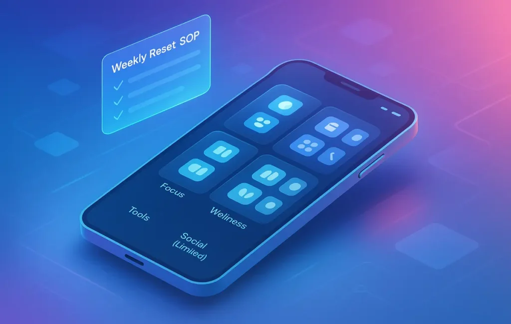
🔁 The Weekly Reset SOP (Re-qualify Each Icon)
A single-screen phone is only as good as your review loop. The Weekly Reset SOP takes five minutes and keeps entropy out:
-
Screenshot the screen and archive it in a “Phone Layout” album. This gives you history and discourages random mid-week edits.
-
Tally three metrics from Screen Time/Digital Wellbeing: total unlocks, top 3 apps by time, and pickups-per-app.
-
Re-qualify each icon using one question: Did this app improve the last week’s outcomes? If not, demote it to search.
-
Rotate the two utility slots to match the coming week’s largest project.
-
Set one friction rule for the week (e.g., no email before 11:00; messaging pulls only at 13:00 and 17:00).
Users who actually do this tiny SOP report a noticeable drop in random unlocks within two weeks and a calmer relationship with the phone. If you like system checklists, layer the cadence with principles from Deep Work 101 so your weekly plan and your home screen tell the same story.
💡 Nerd Tip: If an icon survives three resets without being used, it’s a guilty comfort. Cut it.
📲 Android vs iPhone: Implementation Differences (Gestures, Dock, Search)
Android and iOS both support a pure one-screen layout, but the path to discipline looks a little different:
Search vs Drawer. On iPhone, Spotlight becomes your friend; swipe down and type. On Android, disable smart suggestions in the app drawer and force yourself to search by name. This stops “just browsing” lists.
Dock control. iOS gives you four Dock slots; Android launchers vary, but most allow five. Treat the Dock as your “always now” strip—tasks, notes, and (optionally) calendar. Resist the urge to place a social app there. It will eat your thumb.
Focus/Profiles. iOS Focus Filters can hide entire home screens and mute app badges by context. Use a “Deep Work” focus that leaves only your one screen active. On Android, Work Profile and third-party launchers can emulate the same effect by hiding app icons and badges during a schedule.
Gestures and Reach. Big phones make top-row taps harder. If you’re one-handed often, bias critical actions to the bottom row. Move capture to top-left only if you mostly use two hands. The goal is zero strain during your most common moves.
| Feature | iPhone (iOS) | Android | SOP Recommendation |
|---|---|---|---|
| Search | Spotlight (swipe down) | Search in launcher; disable suggestions | Always type name; never scroll lists. |
| Focus/Profiles | Focus Filters + hidden pages | Work Profile or launcher rules | One active page only during work hours. |
| Dock | 4 icons fixed | 4–5 icons (varies) | Tasks + Notes live here; social never does. |
If you’re blending this with time-boxing, make your calendar or time-blocker a Dock resident. Our review of Best Time-Blocking Apps highlights tools that are lightweight enough to stay out of your way.
💡 Nerd Tip: Map “search” to your dominant-hand swipe. The shorter the path, the fewer the detours.
⚡ Ready to Build Smarter Workflows?
Explore AI workflow builders like HARPA AI, Zapier AI, and n8n plugins. Start automating in minutes—no coding, just creativity.
🔒 Optional Lock-Layer: “App-Free Mode” for Deep Work Blocks
Even the perfect screen can’t protect you from habit. That’s why a Lock-Layer helps: a mode in which the phone looks the same but does nothing besides two or three emergency actions. On iOS, a Deep Work Focus that disables badges, hides additional pages, and limits notifications is enough. On Android, you can stack Work Profile off, Do Not Disturb, and a minimalist launcher page with only a timer and notes.
The trick is visibility. You want a banner or lock-screen note that says, “App-Free Mode: ends at 12:30.” That attribution nudges you to honor the boundary. Pair it with a 50-minute timer and a single escape hatch (calendar or maps if you’re on the move). Everything else remains accessible via search if you truly need it, but the moral friction is high by design.
If you’re serious about focus blocks, the strategies in Deep Work 101 sync perfectly with this lock-layer—time windows, intention setting, and review.
💡 Nerd Tip: Keep a tiny paper card on your desk that says: “Phone = tool, not timeline.” The reminder changes how you reach.
🧩 Extending the System: Paired Watch / Desktop Handoff
A one-screen layout really shines when notifications live elsewhere. Offload most taps to glance-first surfaces:
-
Watch: silent vibrations for only calendar + timers. No message previews. The watch becomes your “tickler,” not a micro-feed.
-
Desktop Handoff: move anything longer than 60 seconds to your computer—schedule, writing, long emails. The phone starts tasks; the desktop finishes them.
-
Ritualized capture: hold the phone for capture, then put it face-down and continue at the desk. This rhythm turns your device into a pass-through, not a destination.
If your desk is an attention trap, re-apply the same single-screen logic there. The patterns in Minimalist Tech Setup: Distraction-Free Desk mirror this SOP for your workspace.
💡 Nerd Tip: “If it takes longer than a minute, escalate to desktop.” That one sentence keeps the phone honest.
🟩 Eric’s Note
No miracle here—just fewer taps between you and done. When my home screen stops asking for attention, I stop negotiating with myself.
🧪 Quick Start SOP (7-Day Adoption Plan)
Day 1 is subtraction: remove the second screen, delete all folders, turn off non-action widgets, and place your 8–12 core apps + two utility slots by quadrant. Day 2 anchors search: for everything not on the screen, type its name—never browse. Day 3 is the Dock: pick two “always now” apps and keep them there for the entire week. Day 4 adds a lock-layer: build one Focus or Work Profile that hides everything except your single screen. Day 5 syncs time-blocking to the Dock and sets two daily windows for communication. Day 6 runs the Weekly Reset SOP and re-qualifies every icon. Day 7 measures: unlocks, top apps, pickups per app; then adjust one thing, not ten.
If you’re new to this level of intentionality, fold in habits from Digital Minimalism and Focus Tools That Beat Procrastination. The tech is the easy part; the routine makes it durable.
💡 Nerd Tip: Screenshot your new screen and set it as your lock-screen wallpaper for a week. It reinforces the map before you unlock.
📬 Want More Smart AI Tips Like This?
Join our free newsletter and get weekly insights on AI tools, no-code apps, and future tech—delivered straight to your inbox. No fluff. Just high-quality content for creators, founders, and future builders.
🔐 100% privacy. No noise. Just value-packed content tips from NerdChips.
🧠 Nerd Verdict
A one-screen layout sounds small, but it’s a keystone change. You’re not “organizing apps”; you’re rebuilding the conversation you have with your phone. Intention moves first, friction drops, and the day feels lighter. Give it seven days with the Weekly Reset, and you’ll never miss the second screen.
🔗 Read Next
-
Align your mindset with Digital Minimalism: Declutter Your Tech for Maximum Efficiency.
-
Upgrade your focus mechanics with Focus Tools That Beat Procrastination.
-
Reinforce deep work patterns via Deep Work 101: Finding Focus in a Noisy World.
-
Mirror simplicity on your desk with Minimalist Tech Setup: Pro Tips for a Distraction-Free Desk.
-
Anchor your day with Best Time-Blocking Apps to Keep You on Track.
❓ FAQ: Nerds Ask, We Answer
💬 Would You Bite?
What’s the one app you’ll remove from your home screen today to protect your focus?
If you share your current layout in the comments, we’ll suggest a quadrant map that fits your workflow.
Crafted by NerdChips for creators and teams who want their best ideas to travel the world.