🚀 Why Landing Pages Still Matter in 2025
Landing pages are still the backbone of online growth in 2025. Whether you’re running ads, launching a new SaaS feature, or capturing leads for a content campaign, the landing page is where visitors turn into customers. Yet despite endless new tools and templates, most landing pages still underperform.
The reason? Many pages fail to apply conversion-centered design—a framework popularized by experts like CXL and Unbounce. These principles go beyond aesthetics. They focus on removing friction, building trust, and driving a single, measurable action. At NerdChips, we’ve explored tools like Best Lead Generation Software and 10 Best Email Marketing Tools, but the page itself is where conversions live or die.
💡 Nerd Tip: Great landing pages don’t ask users to think. They guide users to act.
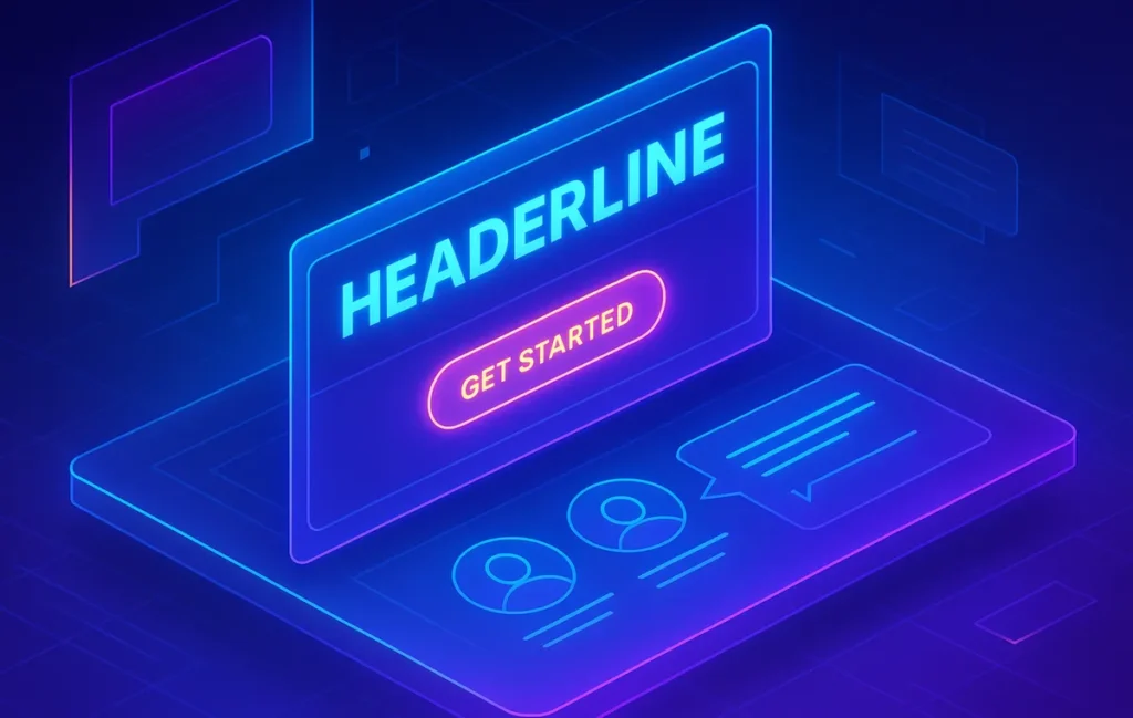
📝 Step 1: Craft a Headline That Hooks
Your headline is the first battle. In 2025, attention spans are shorter than ever—users decide within 2.7 seconds whether to stay or bounce. A high-converting headline must be clear, benefit-driven, and emotionally resonant.
Frameworks like the CXL clarity test recommend reading your headline out loud. If a stranger can’t tell what your offer is within five seconds, it’s too vague. Growth marketers on X often joke: “If your headline needs a subheading to make sense, rewrite it.”
Example: Instead of “Smarter Marketing Solutions,” use “Double Your Email ROI With AI-Driven Campaigns.” Specificity beats buzzwords every time.
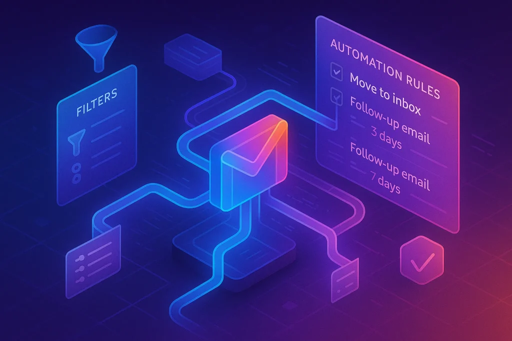
🎯 Step 2: Optimize Your CTA (Call-to-Action)
The CTA is the heartbeat of your page. Modern studies show button copy alone can improve conversions by 10–15% if tailored to the audience. The classic “Submit” no longer works—your CTA should finish the sentence, “I want to…”
For example:
-
“Get My Free Report”
-
“Start My Free Trial”
-
“Save My Seat”
Placement matters too. High-converting pages often use multiple CTAs, placed both above the fold and after persuasive sections. Unbounce recommends aligning CTAs with intent: an early button for high-intent users, and a final push after testimonials for hesitant ones.
💡 Nerd Tip: Test CTA color contrast. A HubSpot test found that switching from green to red increased conversions by 21%, proving design psychology still matters.
👥 Step 3: Add Social Proof and Trust Signals
Visitors rarely convert without reassurance. In 2025, social proof is non-negotiable. Reviews, testimonials, case studies, and even micro-trust signals like “Used by 5,000+ teams” can significantly reduce friction.
CXL research shows that adding a single testimonial block near the CTA lifted conversions by 12% on average. But authenticity is critical—users can smell fake reviews instantly. Screenshots of real tweets or LinkedIn posts carry more weight than polished copy.
Don’t overlook trust badges either. Payment security icons, GDPR compliance notes, or media mentions build subconscious confidence. For SaaS pages, showcasing integrations with well-known tools like HubSpot or Salesforce works as credibility shortcuts.
💡 Nerd Tip: Rotate testimonials. Fresh proof keeps pages from feeling stale to repeat visitors.
🧭 Step 4: Eliminate Distractions
High-converting landing pages are ruthlessly focused. Unlike homepages, they don’t try to do everything. Navigation bars, footer menus, and unrelated CTAs are conversion killers.
Growth hacking checklists often include the “one-page, one-goal” rule. Every section should either explain the offer, build trust, or drive action. Anything else—like extra blog links or unrelated banners—should be stripped.
In NerdChips’ own A/B test (see A/B Testing Made Easy), removing a navigation bar increased sign-up rates by 18% on a campaign landing page. This reinforces the principle: less choice, more action.
🛠️ Step 5: Use the Right Tools
Building a landing page in 2025 doesn’t require a coding degree. No-code platforms have matured to deliver speed, flexibility, and integrations.
-
Carrd: Perfect for solopreneurs. Lightweight, fast, and ideal for simple lead capture pages.
-
Webflow: Offers deep design flexibility with CMS power, great for marketers who want control.
-
Unbounce: Still the gold standard for marketers focused on A/B testing and conversion optimization.
-
HubSpot Landing Pages: Best for B2B teams that want CRM integration baked in.
The right tool depends on scale. Solopreneurs might start with Carrd, while growth teams that live in CRM vs. Marketing Automation platforms often prefer HubSpot for seamless workflows.
💡 Nerd Tip: Choose tools based on integration, not templates. A beautiful design without CRM or email sync is a dead end.
📊 Benchmarks & Real-World Metrics
Numbers show the difference between good and great pages. Industry benchmarks in 2025 put average landing page conversion at 4.3%, but top-performing pages regularly hit 10–20%.
One SaaS company reported that after switching from a generic template to a conversion-centered layout with clear CTA and social proof, their demo sign-ups grew by 27% in two months. Conversely, a failed campaign that ignored mobile optimization saw bounce rates spike to 70% despite strong copy.
These metrics underline a key truth: conversion isn’t about one “magic button,” but about aligning every page element with user intent.
⚡ Ready to Build Pages That Actually Convert?
Explore tools like Unbounce, Webflow, and HubSpot Landing Pages. Start designing with conversion-centered frameworks—not just pretty templates.
📂 Advanced Case Studies: SaaS vs. eCommerce
Case studies prove how conversion-centered landing pages make measurable differences.
A B2B SaaS company offering project management software ran into stagnation with a landing page that used the headline “All-in-One Productivity Suite.” Conversion hovered at 3.8%. After switching to a headline that spoke directly to pain points—“Cut Meeting Time by 27% With Our Workflow Software”—and updating the CTA to “Start My Free 14-Day Trial,” conversion nearly doubled to 7.1%. What changed wasn’t the product, but the clarity of the promise.
Meanwhile, an eCommerce fashion brand focused on checkout abandonment. Their old landing page featured large product visuals but lacked trust signals. By adding real customer reviews, a “30-Day Free Returns” badge, and a subtle note that their payment gateway was “SSL secured,” conversion climbed by 18% in six weeks. A Reddit shopper even commented: “The return guarantee is why I pulled the trigger—I felt safe.”
These examples reinforce a key lesson: SaaS buyers want clear, quantified outcomes, while eCommerce buyers need reassurance. Landing pages must reflect these different psychologies.
📊 A/B Testing & Iteration
Landing pages are never “finished.” The best teams in 2025 treat them as living assets—always tested, always optimized.
Frameworks from CXL emphasize the “test everything” mindset: headlines, CTA copy, button color, form length, even testimonial placement. A startup shared on X: “We tested 3 CTA versions in 14 days. ‘Get Started Free’ beat ‘Request a Demo’ by 22%. That tweak alone paid for the entire campaign.”
Tools like Unbounce and HubSpot Landing Pages now integrate A/B testing natively. Marketers can set up variants in minutes, with AI auto-distributing traffic to winning versions. For high-volume campaigns, this iterative process can lift conversions by 15–30% over time.
💡 Nerd Tip: Don’t guess. Always test. What feels “clever” to you may confuse your audience.
For deeper insight, explore A/B Testing Made Easy to build a systematic process.
⚡ Psychology of Conversion
Behind every click is human psychology. High-converting pages don’t just look good—they leverage behavioral science.
-
Loss Aversion: People fear missing out more than they value gains. A headline like “Don’t Miss Out—Offer Ends Tonight” can outperform “Sign Up for a Discount.”
-
Social Validation: Humans copy others. Highlighting “5,000+ creators already joined” reassures visitors that they won’t be the first.
-
Clarity Over Cleverness: A witty slogan might impress your team, but users want clarity. Studies show straightforward copy consistently outperforms jargon-filled text.
Growth hacking playbooks often remind us that conversions happen when psychology meets design. At NerdChips, we’ve seen this firsthand: when clients applied behavioral triggers, their landing pages didn’t just get prettier—they got profitable.
📱 Mobile-First Design: The 60% Rule
In 2025, over 60% of traffic to landing pages comes from mobile devices. Yet too many pages are still designed desktop-first, leading to broken layouts and slow load times on phones.
One SaaS company saw conversions fall from 5% to 2% simply because their form fields were too small on mobile. After optimizing for thumb-friendly design, larger buttons, and faster load speeds, conversions bounced back to 6.2%. Google’s Core Web Vitals make this even more critical: a slow mobile page is penalized in search and abandoned by users.
For eCommerce, mobile-first means easy scrolling, fewer fields, and one-tap payment options. Brands that adopt Apple Pay and Google Pay integration on landing pages report higher checkout completion rates than those requiring manual credit card entry.
💡 Nerd Tip: Build on desktop, but test obsessively on mobile. If it fails on a small screen, it fails—period.
🔮 The Future of Landing Pages (2026 and Beyond)
Landing pages won’t look static in the next few years—they’ll become adaptive and intelligent.
AI personalization is already emerging. Platforms like HubSpot are experimenting with dynamic headlines that change based on user data. Imagine a landing page that greets a visitor from LinkedIn with “Grow Your Network Faster” while showing someone from Google Ads “Boost Your ROI Today.” Early adopters report 10–20% lifts in conversions using personalization engines.
We’ll also see real-time optimization. AI will test variations continuously, adjusting CTAs and images without human input. Unbounce has hinted at predictive landing pages that learn as they run.
Finally, expect voice and conversational design. Instead of static forms, users may engage with AI chat widgets embedded directly in the landing page, blending the line between page and funnel.
At NerdChips, our take is clear: by 2026, landing pages will no longer be one-size-fits-all assets—they’ll be fluid experiences that reshape themselves to maximize conversions for every unique visitor.
Want More Smart AI Tips Like This?
Join our free newsletter and get weekly insights on AI tools, no-code apps, and growth frameworks—delivered straight to your inbox. No fluff. Just value-packed insights from NerdChips.
100% privacy. No spam. Only strategies that convert.
🧠 Nerd Verdict
Landing pages in 2025 aren’t about flashy animations or the newest templates. They’re about disciplined conversion-centered design: a sharp headline, persuasive proof, irresistible CTAs, and zero distractions. Tools like Unbounce, Webflow, and HubSpot make the mechanics easy, but the mindset makes the difference. At NerdChips, our verdict is simple: the best landing page is the one that gets out of its own way and gets the user to act.
❓ Nerds Ask, We Answer
💬 Would You Bite?
Do you see landing pages as a design exercise, or are you ready to treat them as conversion machines built with psychology and testing?
Crafted by NerdChips for creators and marketers who want their clicks to turn into customers.