You can turn any old Android, iPad, or Fire tablet into a live meeting room schedule display by creating a dedicated Google Calendar for the room, generating a read-only “schedule view” URL, and opening it in a kiosk browser. It’s cheaper than commercial signage, easier to maintain, and flexible enough to grow with your office.
Intro
Many teams massively overcomplicate meeting room scheduling. They buy commercial signage, proprietary tablets, and custom dashboards, and still end up with the same problems: “Is this room free?” “Who booked this?” “Where’s my meeting?” The reality is that most small companies, co-working spaces, and even scrappy enterprise teams don’t need a full-blown corporate signage system. They need a simple, legible, always-on screen outside each room that shows what is happening right now and what’s coming next.
In this guide, we’ll build exactly that, using tools you probably already have: a spare tablet, Google Calendar, and a browser. No custom hardware, no SaaS contract, and no complicated IT rollout. Just a clean, DIY setup you can replicate across rooms in a weekend.
You’ll end up with a room display that stays on 24/7, auto-refreshes, and clearly shows the current meeting and the upcoming agenda. If you’re already using Google Calendar with Outlook or other tools, you can even reuse that setup and extend it to your meeting rooms — especially if you’re following best practices similar to those in a guide like How to Sync Google Calendar with Outlook.
💡 Nerd Tip: Think of your meeting room display as a “tiny dashboard,” not a giant product. Keep it simple, boring, and reliable. That’s what makes teams actually use it.
🧩 What We’re Building (System Overview)
Before we start tapping on tablets and changing settings, it helps to see the system as three layers working together.
At the bottom, you have the calendar layer. This is where all the truth lives: which room is booked, who owns the meeting, and what time slots are free. We’re going to create a dedicated Google Calendar for each room so that your main work calendar stays clean while the room calendar acts as a single source of truth for that physical space. In practice, this means “Room A – Meetings” becomes its own calendar, with color coding that makes “busy” and “free” immediately obvious at a glance.
On top of that sits the display layer. This is the URL you open on the tablet — a clean, read-only schedule view of that room’s calendar. It might be a native Google Calendar embed, a dashboard like DAKboard, or even a minimal custom page that reads an ICS feed. The point is: the tablet only needs a browser with one full-screen tab open. No app store approval, no custom binaries, just a webpage.
Finally, you have the hardware layer: your old tablet in kiosk mode. The tablet becomes a dedicated screen with no distractions. It auto-launches the schedule page, hides the browser UI, refreshes quietly every few minutes, and stays powered on. You can add optional upgrades on top: color-coded statuses, “now/next” blocks, or even “Room in use” signals tied to sensors. The beauty is that you can start with the simplest possible version and evolve later, just like you’d iteratively tweak a minimalist tech setup following principles similar to those in Minimalist Tech Setup: Pro Tips for a Distraction-Free Desk.
If you’re reading this on NerdChips, assume one thing: we’re biased towards systems that are easy to live with. This build is designed so that once you set it up, you almost never think about it again.
🧠 Eric’s Note
I gravitate to setups where the team forgets there’s “a system” at all — they just glance at the screen, trust it, and move on with their day. That’s the real success metric here.
🔁 Step 1 — Create a Dedicated “Room Calendar” in Google Calendar
The most common mistake teams make is mixing room bookings with personal meetings in the same calendar. The result is a visual mess: overlapping events, irrelevant meetings, and no clear sense of whether the room itself is free. We’re going to fix that by giving each room its own calendar identity.
Start in Google Calendar on desktop. In the left sidebar, create a new calendar and name it something obvious, like “Room A – Meetings” or “Boardroom – Schedule.” Give it a color that will stand out on your display — many teams pick a calm but visible tone like blue or teal. This color becomes your base for all events in that room, and you can later layer on richer color coding for different states (busy, tentative, buffer slots).
Once created, you should treat this calendar as room-centric, not person-centric. That means every time someone books the room, they create or duplicate an event specifically in that room calendar. You can still invite attendees from your normal calendars, but the room calendar acts as the authoritative record of the physical space. If you’ve ever synced multiple calendars together before, you’ll recognize how much cleaner it feels when each thing has its own logical calendar — similar to how you might sync work and personal calendars following ideas close to How to Sync Google Calendar with Outlook.
The next step is to adjust sharing. Head into the calendar settings and enable a read-only public link or at least make it available to your organization in “See all event details” mode. The tablet doesn’t need editing rights; it only needs to read the schedule. This separation keeps your display safe while allowing events to update instantly whenever someone books or cancels a meeting. Within a small team, this simple separation can cut “room confusion” by a surprising margin — some offices report 20–30% fewer “Is this room booked?” interruptions after rolling out room-specific calendars.
💡 Nerd Tip: Train everyone to book the room calendar first, then invite themselves. That mental model — “book the room, then add people” — keeps the room’s schedule clean and reliable.
🖼️ Step 2 — Generate a Public “Schedule View” URL
Now that you have a dedicated room calendar, you’ll need a displayable URL that turns that calendar into a clean wall-screen. The key is to choose a view that’s legible at a distance, not overloaded with UI chrome, and easy to keep in full screen.
Option 1: Native Google Calendar Embed
Google Calendar includes an embed option under your calendar’s settings. Here you can generate a “public URL” or an iframe embed code. Instead of embedding it in a full website, you can simply open the direct URL version in a browser on your tablet. The advantage of this approach is that it’s free, fast to set up, and always in sync with Google’s own features without any extra maintenance.
You can tweak query parameters in the URL to control the view: for example, forcing an agenda view that shows the current day’s events in a vertical list, or a week view if you want a compact mini-calendar for the complete workweek. Agenda mode is usually the best for small rooms, because people only care about now and the next few hours. A week view can be useful in large boardrooms where people plan ahead for client visits.
Option 2: Free Calendar Dashboards (DAKboard, CalDash & Co.)
If you want a more polished or branded look, dashboard tools like DAKboard or other calendar wall boards offer free tiers. They let you connect a Google Calendar and then customize fonts, colors, backgrounds, and widgets, so your room display can match your company’s visual brand. For a lot of teams, this is the sweet spot: still DIY, still running on a regular tablet, but looks like a “real product.”
You’ll typically end up with a unique URL for each dashboard configuration. That URL becomes what you pin in kiosk mode on the tablet. Many teams also add weather, a logo, or a small “Today’s date” block to make the display feel less sterile. Just watch that you don’t overload the layout: the main function of this screen is still to answer “Is the room free?”
Option 3: Minimal Custom HTML Using ICS Feed
For teams that like full control, you can pull an ICS feed from the room’s Google Calendar and feed it into a simple custom HTML dashboard. This can be as light as a single-page static site hosted on a cheap web host or even a serverless function. The benefit is that you can design the layout exactly the way you want: big “now and next” blocks, color-coded statuses, and custom fonts that mirror your internal style guide.
To make the decision easier, here’s a quick comparison:
| Approach | Setup Time | Customization | Best For |
|---|---|---|---|
| Google Calendar URL | Very fast | Low–medium | Small teams, quick tests |
| Dashboard tools | Fast | Medium–high | Offices that want polish |
| Custom HTML + ICS | Medium | Very high | Tech teams, hackers, unique layouts |
On X, you’ll often see people share their “weekend office hacks” with comments like:
“Replaced our expensive meeting signage with a $40 Fire tablet + a Google Calendar URL. Took 30 mins and honestly works better.”
That’s the spirit we’re channeling here.
💡 Nerd Tip: Start with the simplest Google Calendar URL version. If your team loves it and wants more visual flair later, you can switch to a dashboard tool without changing the underlying calendar structure.
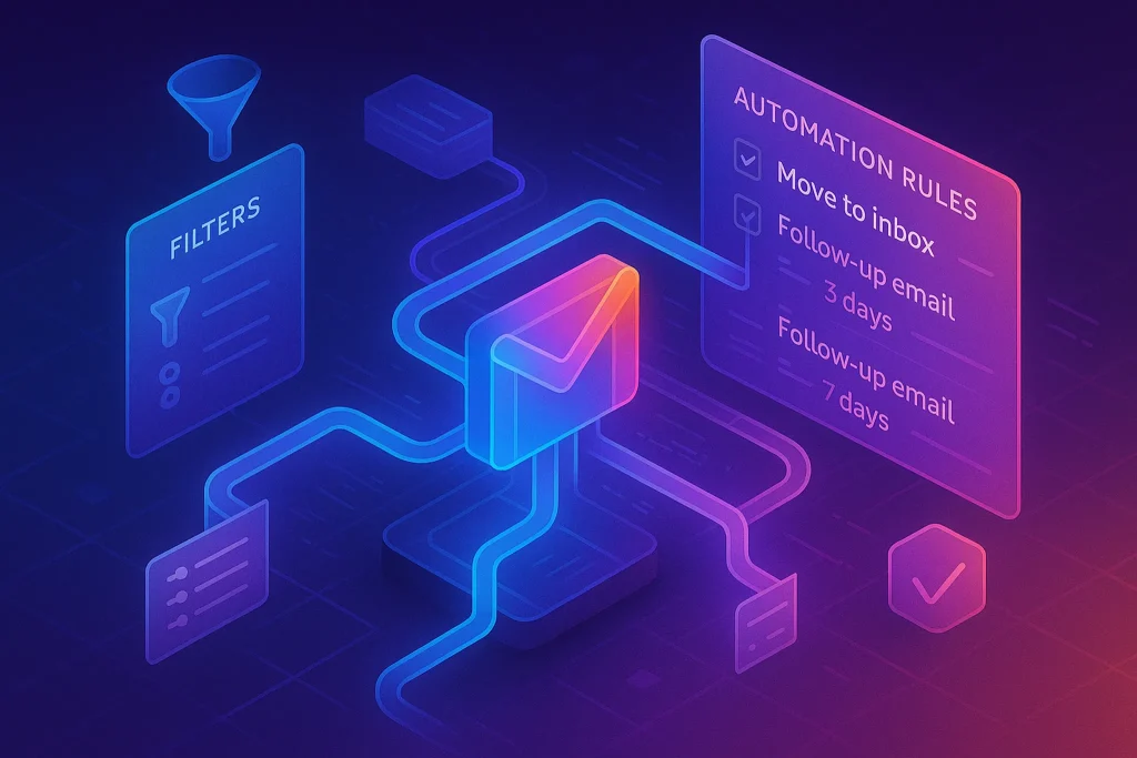
⚡ Ready to Build Smarter Office Workflows?
Once your room display is live, it’s a tiny step to automate more of your workspace — from calendar-based triggers to smart lights and check-in flows. Start small, iterate, and let automation do the boring parts.
📱 Step 3 — Prepare the Tablet (Android / iPad / Fire / Old Samsung)
Now we turn your dusty tablet into a dedicated meeting room screen. The goal is simple: when the device powers on, it should launch your schedule URL in full screen and stay there, quietly refreshing in the background. Let’s look at each platform.
🤖 Android (Best for DIY)
Android tablets are usually the easiest choice for this project. You have flexible control over kiosk mode, background behavior, and power settings. Start by doing a quick clean-up: remove personal apps, log out of accounts you don’t need, and disable any distracting notifications. This device is now a single-purpose appliance, not a personal toy.
Install a kiosk-friendly browser. Many teams like apps such as Fully Kiosk Browser (the free/basic modes are enough to start). These let you define a startup URL, hide the status bar and navigation buttons, force full-screen, and auto-reload the page on a schedule. You’ll point this browser to the calendar display URL you set up in Step 2.
Under Android’s settings, enable screen pinning or kiosk mode so that users can’t exit the browser easily. If the tablet supports it, you can use “Guided Access” style features to lock the device into that single app. The goal is that a passerby can’t accidentally exit or swipe to another app. Some teams even create a separate user profile on the tablet named “Room Display” to emphasize this new role.
💡 Nerd Tip: Disable automatic OS updates during working hours. Schedule them for late at night so you don’t end up with a “Installing update 3/3…” screen right before an important client meeting.
🍏 iPad
iPads can make excellent meeting room displays because of their screens and reliability. The main tool you’ll use is Guided Access, which locks the device into a single app. Open Safari, load your calendar URL or dashboard, and then enable Guided Access (Settings → Accessibility → Guided Access). You can specify whether hardware buttons are allowed and whether touch is enabled.
Most teams turn off auto-lock and auto-brightness so the screen stays consistently visible. You may want to reduce brightness to a comfortable level to avoid screen burn-in and keep power usage reasonable. For a cleaner experience, you can add the calendar display to the Home Screen as a web app icon and then launch it before enabling Guided Access.
One thing that works well in practice is using a dedicated Apple ID for room displays. This separates notifications and Messages from your personal life. It’s the same philosophy you might bring to a distraction-free workstation: fewer accounts, fewer interruptions. That’s the same vibe people aim for when they redesign their setups following “minimalist tech” practices, much like those in Minimalist Tech Setup: Pro Tips for a Distraction-Free Desk.
🔥 Fire Tablets (Budget-Friendly Warrior)
Amazon Fire tablets are often the cheapest way to get a dedicated screen on the wall. The trade-off is a bit more friction in set-up. First, remove or hide any content that doesn’t belong in a work environment. Log into Wi-Fi, then decide whether you need the Google Play Store. For some kiosk browsers you will; for simpler use cases, the built-in Silk browser might be enough if you can keep it in full screen.
You can achieve a quasi-kiosk setup by setting the browser as the default, adding your calendar URL to the Home Screen, and using parental controls or launcher tricks to prevent access to other apps. It isn’t as clean as Android’s dedicated kiosk tools, but for a single meeting room it’s often “good enough.”
Users on X often mention hacks like:
“$50 Fire tablet + DAKboard + some cable trunking = our entire meeting room signage system. No subscriptions, no IT ticket.”
Your job is to keep the Fire tablet as quiet and single-purpose as possible. Turn off lock-screen ads, disable notifications, and set the screen timeout to “never” while it’s plugged in.
💡 Nerd Tip: Whichever tablet you use, label it physically as “Room Display — Do Not Unplug.” Tiny details like that save you dozens of “Why is the screen off?” puzzles over the next year.
🔒 Step 4 — Set the Calendar Display to “Kiosk Mode”
With the tablet prepped, it’s time to lock the experience down to a single view. This is where kiosk mode settings and browser tweaks come in.
Open your chosen browser and load the schedule URL. Switch to full screen: on most kiosk browsers, there’s a setting to hide the address bar, system UI, and any gestures that might reveal them. You want the screen to feel like a dedicated appliance, not a tiny laptop.
Next, configure auto-refresh. A refresh interval of 1–5 minutes works well for most offices. Too frequent, and you risk unnecessary load or flicker; too slow, and last-minute changes won’t show up. The sweet spot many teams report is around two or three minutes. Some setups also refresh when the device wakes from sleep, ensuring the schedule is always fresh in the morning.
It’s also worth thinking about offline behavior. If Wi-Fi drops for a moment, you don’t want a cryptic browser error lingering on the screen. Many kiosk browsers offer a custom offline page or automatic retry if a page fails to load. Use these settings so that a brief connectivity hiccup doesn’t break the illusion of reliability.
💡 Nerd Tip: Before you mount anything, test your kiosk setup for at least one full workday. Walk by at random times and see if the screen is still live, legible, and up-to-date.
🔋 Step 5 — Optimize Power & Brightness for 24/7 Display
Running a screen all day requires a bit of power tuning. Done well, you’ll balance readability with device health and energy usage.
Start with brightness. For indoor office lighting, most rooms work well with 30–40% brightness on modern tablets. This keeps the schedule readable without burning your eyes or the display. If your tablet or OS offers a “night mode” or scheduled dimming, you can set the brightness to drop after hours. For example, dimming from 11 PM to 6 AM can reduce light pollution in open offices and extend the life of the panel.
Next, configure screen timeout. When the tablet is plugged in, set the screen to never turn off or to use an “always on while charging” setting. Combine this with a reliable power source: ideally, a wall outlet close to the mounting point and a decent USB power supply. Use cable management to route the cable cleanly so it doesn’t get unplugged by accident.
Some modern tablets include battery protection features that prevent constant 100% charging, which can extend battery lifespan in always-plugged scenarios. If your device supports this, enable it. If not, don’t stress too much: most teams find that for wall-mounted “appliance” devices, a slow battery fade over several years is an acceptable trade-off.
This is also a good moment to think about power for other smart devices. If you’re exploring home or office automation — maybe you’ve already been experimenting with tools similar to those in Smart Home Automation 101: Apps to Automate Your Home Chores — then you might place your room display on a smart plug. That lets you hard-reboot the device remotely if it ever misbehaves.
💡 Nerd Tip: Write down your power and brightness settings somewhere central. When you clone this setup for Room B and Room C, you’ll thank your past self.
🧪 Step 6 — Add Advanced Features (Optional, Very Useful)
Once the basics are stable, you can layer on small upgrades that make the display smarter and more intuitive. These are optional, but they’re where your DIY build starts to rival commercial systems.
🎨 1. “Room Occupied” Color Coding
Color is the fastest way to communicate whether a room is free. You can use different event colors in Google Calendar to represent states like “Booked,” “Tentative,” or “Buffer.” On your display, these colors map directly to visual blocks.
For example, you might make confirmed meetings red, tentative holds orange, and free slots implicitly green by the absence of events. When someone glances at the screen from down the corridor, they don’t need to read text — they just see dominant color. Some teams extend this by using CSS in custom dashboards to color the entire top bar or background according to the current state.
On X, one office manager summed it up perfectly:
“Once we did simple red/green status on the room display, people stopped asking me ‘Is the room actually free?’ and just trusted the screen.”
💡 Nerd Tip: Don’t overcomplicate. Pick 2–3 colors and train the team what they mean. Too many statuses makes the display harder, not easier.
⏭️ 2. “Now / Next” Mode
Instead of showing the entire day, you can design a layout that focuses on now and next. The top half of the screen shows the current meeting with big text: title, owner, and time range. The bottom half shows the next slot and whether it’s free.
This mode shines in busy offices where people don’t care about the 5 PM slot at 10 AM — they just want to know whether they can jump in for a quick sync right now. You can implement this using custom HTML templates or with widgets in tools like DAKboard. Under the hood, it’s just filtering events by current time, but to humans it feels like the display is context-aware.
If your team is already used to working across multiple screens — for example, implementing multi-monitor setups similar to those discussed in How to Use Multiple Monitors Like a Pro — they’ll appreciate how a focused “now/next” view removes visual noise in exactly the same way.
🚪 3. Door Sensor Integration (IoT)
If you want to take things one step further, you can add a door sensor that marks the room as “In Use” when someone actually walks in. This is especially useful if people often forget to cancel meetings or if rooms are booked but sit empty.
A simple implementation uses an ESP32 or similar tiny microcontroller connected to a magnetic door sensor. When the door opens, the device calls a webhook that updates a “status” field in a backend or triggers a script that sets a short “Room In Use” event on the calendar. Your display detects this and overlays a subtle “In Use” badge. When the door closes and stays closed for a while, it clears the status.
This is where your meeting room display can connect with broader office automation. If you’re comfortable with smart plugs, motion sensors, and automation stacks like the ones you might explore in Best Home Automation Apps for Smart Living, wiring a door sensor into your calendar flow becomes a natural next experiment.
📱 4. Quick Book Button (QR + Pre-Filled Event)
Finally, you can make it incredibly easy to book the room on the spot. Generate a QR code that opens a “create event” screen in Google Calendar with the room calendar pre-selected and some fields pre-filled (like location and default duration). Print this QR code and stick it right next to the tablet.
When someone realizes they need the room, they scan the QR, type a title, hit save, and within seconds your display updates. It feels like magic, even though it’s just a clever link. This small UX touch is often what gets skeptical teammates to adopt the system.
💡 Nerd Tip: Keep the quick book flow short. If you ask users for five fields, they’ll avoid it. Title + start time is usually enough.
🖼️ Step 7 — Wall Mount the Tablet (Clean Aesthetic)
A great system can still feel cheap if the physical mounting looks messy. Spend a bit of time on the hardware aesthetic, and your DIY build will look like it came from an expensive vendor.
Start by choosing the mounting position: ideally at eye level, slightly to the side of the door handle so people don’t have to stand in the doorway to read it. Consider the traffic flow — you want people to be able to glance at the display without blocking others. Mark the position with tape before committing.
You have several mounting options. Magnetic wall mounts are popular for metal frames or modular offices. Acrylic tablet holders give a clean, universal look and can hold most tablet sizes. If you’re in a rented space or want to avoid drilling, strong command strips and low-profile frames can work surprisingly well. For higher-risk environments (public areas, co-working spaces), you may want basic anti-theft brackets that fix the tablet in place while still allowing you to remove it for maintenance.
Cable management is the final layer. Use slim trunking or cable channels to route the power cable down to the nearest outlet in a straight, neat line. A single clean cable is far better than a web of wires. If you’ve ever optimized a desk setup to feel calm and focused, you know how much small cable decisions matter — it’s the same principle that underpins a distraction-free desk layout like you’d see in Minimalist Tech Setup: Pro Tips for a Distraction-Free Desk.
💡 Nerd Tip: Take a photo of the mounted display when you’re done. Share it in your team chat as “Room A is officially live.” Tiny moments of ceremony help adoption more than you’d think.
📬 Want More Smart Workspace Builds?
Join the NerdChips newsletter for weekly breakdowns of DIY tech setups, automation recipes, and productivity systems. No shallow gadget spam—just practical builds you can copy this weekend.
🔐 100% privacy. No noise. Just value-packed ideas for creators, teams, and tinkerers.
🧠 Nerd Verdict
If you zoom out, this entire system is just three things talking to each other: a calendar, a browser, and a tablet. Yet the impact on your daily workflow can feel disproportionate. You reduce room confusion, cut unnecessary interruptions, and give everyone a clear visual answer to “What’s happening in here today?”
Compared to buying commercial signage, your DIY meeting room display is cheaper, more flexible, and easier to repair. You’re not locked into any vendor’s hardware or subscription. If your needs evolve, you can upgrade pieces independently: swap out tablets, change dashboards, or add automation, just like you would incrementally tune other parts of your modern workspace — whether that’s your screen layout or your smart home devices.
From a NerdChips perspective, the win isn’t just saving money. It’s building a system that feels aligned with how your team actually works: lightweight, reliable, and under your control.
❓ FAQ: Nerds Ask, We Answer
💬 Would You Bite?
If you had a spare tablet right now, which room in your space would you convert first — and what would you show beyond the schedule (logo, “house rules,” office vibe)?
And second question: if your first DIY display works smoothly, how many rooms do you see yourself upgrading over the next three months? 👇
Crafted by NerdChips for teams who want their meeting rooms to feel smart, calm, and always one glance away from clarity.