🧠 Why Infographics Still Work in 2025
In an era dominated by auto-generated text and information overload, infographics still cut through the noise.
They simplify complexity. They boost retention. They’re highly shareable. And unlike long-form articles, they convey key takeaways in seconds—which is why they remain a top format in modern content strategies.
Infographics are especially powerful when used as part of a storytelling-driven approach, allowing marketers and educators to turn data into narratives. As we explored in Storytelling in Content Marketing, blending visuals with structured messaging dramatically improves engagement and comprehension.
Whether you’re a blogger, an agency, or a solo content creator, mastering infographics means unlocking higher reach, better SEO, and stronger brand recall.
🛠️ Best Tools to Design Stunning Infographics (Without Being a Designer)
Forget expensive software or hiring freelance designers. These tools make DIY infographic creation fast, intuitive, and fun—no design background required.
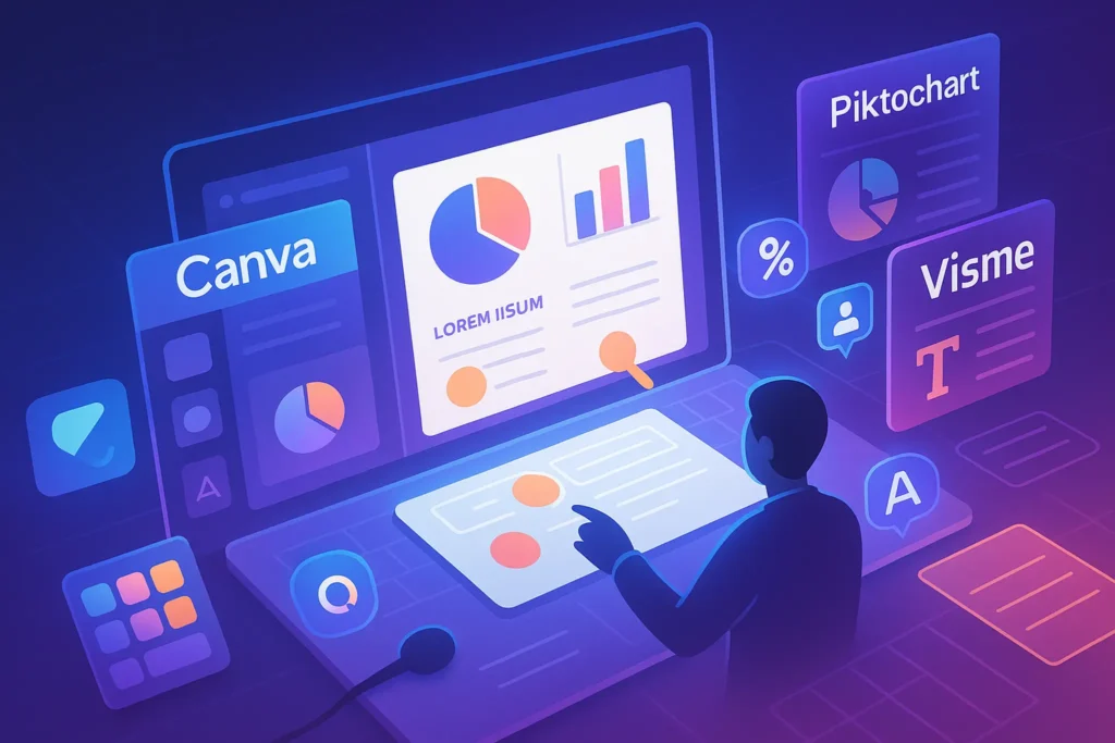
1. Canva
Why It’s Popular:
Canva is the most widely used visual design tool for a reason. It offers thousands of infographic templates, drag-and-drop simplicity, built-in icons, and flexible export options. Whether you’re creating a social share graphic or an embedded blog visual, Canva delivers.
✅ Free plan with generous features
✅ Ideal for list-based or comparison infographics
✅ Includes brand kits and resize tools
Best For: Bloggers, social media managers, content marketers
Pair it with: Repurposing Content strategies to turn long blog posts into bite-sized visuals.
2. Piktochart
Why It’s Unique:
Unlike Canva, Piktochart is built specifically for data visualization. It includes smart charting tools, spreadsheet integration, and infographic types ideal for educational or corporate use.
✅ Focus on numbers and charts
✅ Clean, professional templates
✅ Excellent for reports, pitch decks, or academic briefs
Best For: Educators, nonprofits, report-heavy teams
Bonus: Its structured layout system helps with creating infographics that match accessibility and formatting standards.
3. Venngage
Why It’s Versatile:
Venngage specializes in pre-built infographic categories—timelines, step-by-step flows, statistical layouts, and more. With icons, illustrations, and intuitive blocks, you can easily turn outlines into visual stories.
✅ Strong business infographic library
✅ Option to brand visuals with team colors
✅ Free tier available with watermark
Best For: B2B marketers, HR teams, instructional designers
If you’re launching your blog or brand from scratch, this pairs well with tools we highlighted in Best AI Tools I’d Use to Launch a Blog From Scratch.
4. Adobe Express (formerly Spark)
Why Creatives Like It:
If you’re already inside the Adobe ecosystem, Express gives you fast access to premium fonts, brand assets, and stylish templates—plus easy export for social.
✅ Clean UI, Adobe-quality polish
✅ Animation and motion elements
✅ Syncs with Creative Cloud assets
Best For: Creatives, brand designers, visual-first teams
5. Visme
Why It’s Powerful:
Visme bridges the gap between infographic creation and interactive content. Beyond visuals, you can embed polls, videos, and even opt-in forms. It’s perfect for marketers building landing pages or slide decks with storytelling flow.
✅ Interactive elements (hover, click)
✅ Analytics on views and shares
✅ Strong export controls (embed, PDF, iframe)
Best For: SaaS content marketers, webinar hosts, advanced educators
Also useful for presentation-based workflows, as seen in tools like Figma Make Review.
🎨 Design Like a Pro: Best Practices for Layout and Clarity
An infographic isn’t just a pretty picture—it’s a visual argument. If your layout is cluttered or your message unclear, users will bounce in seconds. Here’s how to make sure they stay:
🧱 1. Visual Hierarchy Comes First
Use size, color, and placement to guide the reader’s eye. Bigger headers, bold numbers, and consistent sectioning help convey flow.
A good rule: Readers should understand your main point within 3 seconds of scanning.
⚪ 2. Embrace Whitespace
Don’t fear empty space—it provides breathing room. Cramming too many icons, colors, or fonts makes your infographic overwhelming. Let key elements shine.
🔠 3. Font Consistency Is Non-Negotiable
Limit yourself to 2–3 fonts. Use a clear, readable typeface for body text and a bolder style for headers. Make sure font size scales logically from section to section.
🧩 4. Icons Should Inform, Not Decorate
Use icons to replace or reinforce words—not just as visual fluff. Stick with a consistent icon style (line, filled, or flat) throughout the design.
📐 5. Mind Your Dimensions
For blog embeds, aim for 800–1000px width and vertical layout. For social media, try square (1080×1080px) for Instagram, or vertical Pinterest-friendly sizes (1000×1500px).
🧠 Related Read: Our breakdown of Top 10 Content Creation Tools for Bloggers & Designers highlights other assets that pair well with infographics, like AI caption generators and font optimizers.
🎨 How to Use Color Psychology in Infographics
Color isn’t just aesthetic—it’s strategic. Used correctly, it can influence emotion, improve readability, and reinforce branding.
🔴 Red
Grabs attention and conveys urgency. Great for statistical highlights or warnings. Use sparingly.
🟢 Green
Evokes calm, balance, or financial growth. Perfect for sustainability, money-related, or health topics.
🔵 Blue
Conveys trust, clarity, and intelligence. Common in corporate or educational infographics.
🟡 Yellow
Bright, energetic, and eye-catching. Excellent for infographics targeting younger audiences or creative themes.
🟣 Purple
Associated with luxury, insight, or futuristic topics. Useful in tech, AI, or branding discussions.
🧠 Tip: Choose a primary brand color + 1–2 accents. Avoid using more than 5 colors overall.
If you’re working on visual branding long-term, check out our guide to The Future of Content Creation, where we touch on visual identity trends and audience psychology.
🚀 Where to Promote Your Infographic for Maximum Reach
Designing a killer infographic is just step one. To truly make an impact, you need to get it in front of the right eyes—on the right platforms.
🖼️ 1. Embed It in Blog Posts
Use infographics to break up long-form content, explain complex ideas, or summarize findings. Make sure to add alt-text for SEO and accessibility.
Bonus: Embed using
<figure>+<figcaption>for structured markup that Google loves.
Pinterest thrives on vertical, visually rich content—infographics are tailor-made for it. Include keyword-rich descriptions and relevant boards.
💼 3. Post on LinkedIn
Infographics related to business insights, marketing, or trends get great traction on LinkedIn. Frame it with a strong hook and short commentary.
🐦 4. Convert Into Twitter Threads
Break your infographic into carousel-style slides or tweet a summary with the image. Use relevant hashtags like #Infographic #ContentMarketing.
💬 5. Use in Email Newsletters
A thumbnail of your infographic in a newsletter can boost clickthrough rates—especially for educational or how-to topics.
📌 Internal Link Opportunity: Infographics are a great way to apply what we discussed in Repurposing Content, helping you get more mileage out of a single asset.
🔄 Repurpose Your Infographics Like a Pro
Turn one infographic into multiple formats to 10x its reach:
-
🔁 Carousel Slides for LinkedIn & Instagram
-
🎥 Short-form Video using animation in Canva or Adobe Express
-
📥 Downloadable PDF as a lead magnet
-
🧵 Twitter Threads summarizing each section
-
🖼️ Pinterest Pins with alternate color schemes or dimensions
Nerd Tip: Make a “mini infographic” teaser to drive users to the full version on your blog.
📊 Types of Infographics (And When to Use Them)
Not all infographics are built the same. Choosing the right format makes your content more effective, easier to digest, and better suited for your platform or audience.
| Type | Best For |
|---|---|
| 📈 Statistical | Sharing research findings, survey data, reports |
| 🕒 Timeline | Brand stories, history breakdowns, before/after narratives |
| 🔄 Process / Flow | Tutorials, how-to guides, onboarding processes |
| ⚖️ Comparison | Product vs. product, “what changed” formats |
| 🗺️ Geographic / Map | Regional stats, global trends, localization visuals |
| 📋 List-Based | Roundups, checklists, frameworks |
| 🎛 Interactive | Quizzes, dashboards, clickable infographics (Visme excels here) |
✨ Design Tip: Before opening your design tool, identify the narrative structure. Do you want to inform, persuade, or simplify?
💡 Infographic Ideas to Get You Started
Still not sure what to create? Here are some battle-tested content ideas that translate well into infographics:
-
🔁 “7 Mistakes to Avoid When Writing Blog Headlines” → List-based
-
📍 “The Evolution of Google Search (1998–2025)” → Timeline
-
⚖️ “Canva vs. Visme: Feature-by-Feature Comparison” → Comparison
-
🚦 “How to Build a Newsletter Funnel” → Flow/process
-
🌎 “Top 5 Countries Adopting AI Tools in 2025” → Map infographic
-
🔧 “My Personal Content Creation Stack” → Visual tool roundup
Use these to inspire your next blog visual, lead magnet, or LinkedIn carousel.
✅ Infographic Pre-Publish Checklist
Before you hit publish, run your visual through this quick-fire checklist to ensure it’s optimized for performance, clarity, and SEO.
✅ Final Infographic Checklist
- ✔ Title includes a target keyword
- ✔ Clear structure (headers, blocks, whitespace)
- ✔ Optimized file size (under 500 KB)
- ✔ Descriptive alt-text for SEO + accessibility
- ✔ Mobile-friendly and legible fonts
- ✔ Color palette matches your brand
- ✔ Proper file name (e.g., content-strategy-infographic.png)
🧠 Nerd Verdict
Infographics remain one of the highest-ROI formats in the creator toolbox. They educate, they convert, and they live longer online than most formats.
Whether you’re breaking down stats, mapping a process, or telling a story—visuals win hearts and links.
And with tools like Canva, Visme, and Venngage, anyone can turn an idea into an infographic—without being a designer or coder.
❓ FAQ: Nerds Ask, We Answer
💬 Would You Bite?
🎨 What’s the last infographic you actually remembered?
Have you made your own, or are you just getting started?
Drop your favorite infographic tool—or your next topic idea—in the comments below!Let’s turn your data into design together.