-This post may contain affiliate links. If you click on one and make a purchase, I may earn a small commission at no extra cost to you.-
📘 Introduction: Why Mobile-First Video Matters
Mobile isn’t just a device—it’s the primary screen for how we consume content today. With over 75% of global video plays happening on mobile devices, marketers can no longer treat mobile as an afterthought. Whether you’re launching a product, sharing tips, or promoting a service, optimizing your video for mobile viewers is non-negotiable.
But what does mobile-friendly video really mean? It’s more than just scaling down a desktop edit. It means embracing vertical formats, designing for sound-off environments, compressing for faster load times, and capturing attention within the first 3 seconds.
In this guide, we’ll break down the essentials—from the best mobile video formats to the top tools that make the job easier. If you’ve already explored trends in short-form video platforms, you know attention spans are shrinking. Now it’s time to level up your video production for small screens with big impact.
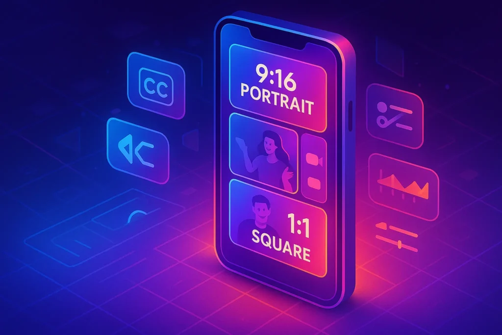
🎬 Mobile-Optimized Video Formats: What Works Best?
When designing content for mobile, screen real estate is everything. Horizontal 16:9 videos often appear letterboxed on phones, wasting valuable space. That’s why 9:16 (vertical) and 1:1 (square) formats dominate mobile feeds.
-
9:16 (Vertical): Perfect for TikTok, Instagram Stories, Reels, and YouTube Shorts. It fills the screen completely, eliminating distractions and increasing immersion.
-
1:1 (Square): A versatile middle ground that works well across platforms like Facebook and Instagram where users may switch between landscape and portrait orientations.
📌 Nerd Tip: Always design with the platform in mind. For example, a vertical video for Reels might underperform on a YouTube homepage where landscape is still king.
👉 Also check out our guide on Video vs. Blogging to understand when each format shines.
🗨️ Captions Are Not Optional: The Sound-Off Reality
Here’s the truth: Most mobile videos are watched without sound—especially on social feeds where autoplay is default. That means if your message depends on narration or dialogue, you’re losing impact unless captions are baked in.
Captions (subtitles or burned-in text) do three key things:
-
Ensure accessibility for deaf/hard-of-hearing viewers
-
Deliver key messaging instantly, even if sound is off
-
Boost retention and watch time by encouraging viewers to follow along
Many platforms like Instagram and TikTok now auto-caption videos, but results can be inconsistent. Instead, use tools that let you customize the font, placement, and style.
🛠️ We’ll explore tools like Kapwing, VEED, and InShot shortly that make adding captions a breeze.
🧠 Curious how captions play a role in short-form content success? Dive into the Short-Form Video Revolution for real-world examples.
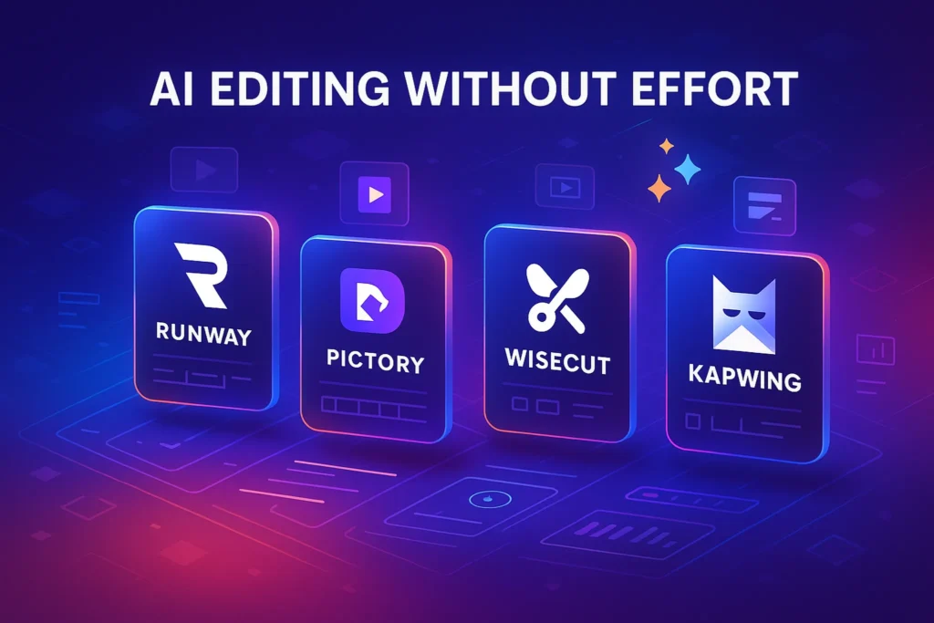
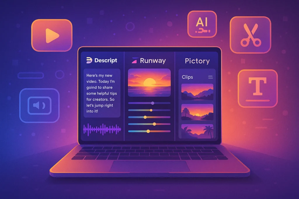
🧰 Essential Tools for Mobile-Friendly Video Creation
Creating video optimized for mobile doesn’t require a Hollywood setup. You just need the right tools. Here are some powerful (yet accessible) options to streamline your mobile-first workflow:
🎥 Kapwing
What it is:
Kapwing is a web-based video editor that makes mobile-friendly video creation incredibly easy—even if you have zero editing experience. It works directly in your browser (no downloads), allowing you to resize, caption, cut, and repurpose content in just a few clicks. Its intuitive interface is perfect for creators focused on speed and shareability.
A browser-based editor ideal for creators who want speed and simplicity.
-
Add subtitles manually or auto-generate
-
Resize videos to vertical, square, or landscape
-
Create split-screen and overlay content
-
Free tier available with watermark
Real Use Case:
Perfect for marketers turning webinars or YouTube videos into short, captioned vertical clips for TikTok, Instagram Reels, or LinkedIn.
✅ Pros:
-
No need to install anything—fully browser-based
-
Supports vertical (9:16), square (1:1), and custom aspect ratios
-
Auto-subtitle generator with decent accuracy
-
Timeline-based editing with drag-and-drop interface
-
Supports team collaboration (in paid plans)
-
Works well for repurposing existing content
❌ Cons:
-
Free version includes a watermark
-
Rendering speed can slow down on large projects
-
Limited advanced features for pro editors (e.g. color grading)
📌 Use case: Perfect for repurposing horizontal YouTube content into vertical clips for Instagram Reels or Shorts.
🎞️ VEED.IO
What it is:
VEED.IO is a powerful all-in-one online video editor designed for marketers and content teams. It combines essential features like subtitling, trimming, compressing, and branding under one clean interface. It also supports auto-resizing for different platforms, which makes it ideal for multi-platform video strategies.
An all-in-one video platform with an intuitive interface.
-
One-click subtitle generator
-
Trim, resize, compress
-
Branded templates for social media
-
Great for teams or agencies
Real Use Case:
Ideal for social media managers who need to churn out multiple branded video versions daily—each tailored for mobile platforms like Reels, TikTok, and YouTube Shorts.
✅ Pros:
-
Fast and clean UI—great for team workflows
-
Auto-captioning with high accuracy (plus manual editing)
-
One-click export for various aspect ratios
-
Brand kit support: logos, color palettes, and fonts
-
Built-in screen recorder and teleprompter
-
Good export quality with compression presets
❌ Cons:
-
Watermarks on free version
-
Limited offline capability (browser-only)
-
Not ideal for complex timeline-based editing or effects
📌 Use case: Batch-creating educational video snippets with clear branding for mobile users.
📱 InShot (Mobile App)
What it is:
InShot is a popular mobile video editing app for iOS and Android that allows you to shoot, edit, and export videos—all from your smartphone. It’s lightweight, fast, and packed with features tailored for creators on the move.
A favorite among mobile-first creators.
-
Edit videos directly on your phone
-
Add text, music, transitions
-
Export in vertical formats with easy compression options
Real Use Case:
Perfect for influencers or small business owners creating Stories, Reels, or quick promo videos directly from their phone.
✅ Pros:
-
Full video workflow on your mobile device
-
Easy-to-use timeline for trimming, splitting, and rearranging clips
-
Wide range of fonts, filters, transitions, and stickers
-
Exports directly to vertical, square, or landscape formats
-
Compression settings built-in for smaller file sizes
-
Affordable one-time Pro upgrade available
❌ Cons:
-
Occasional in-app ads (free version)
-
Less precise editing control vs desktop tools
-
Limited cloud sync or collaboration features
📌 Use case: On-the-go editing for creators shooting with their smartphone.
🌀 HandBrake
What it is:
HandBrake is a free, open-source desktop tool focused on video compression and format conversion. It doesn’t edit videos but is incredibly powerful for shrinking large files while preserving quality—making it perfect for mobile upload optimization.
Open-source tool for video compression (desktop).
-
Shrinks file size without major quality loss
-
Optimized presets for mobile
-
Perfect for pre-upload prep to avoid slow load times
Real Use Case:
Great for content creators uploading long-form tutorials or courses and needing faster mobile playback or reduced hosting bandwidth.
✅ Pros:
-
100% free and open-source
-
Compresses videos dramatically without visible quality loss
-
Supports custom presets for mobile, web, etc.
-
Batch processing and queue functionality
-
Reduces upload time and storage cost significantly
❌ Cons:
-
No video editing or subtitling features
-
Interface may look dated to non-tech users
-
Not cloud-based—runs only on desktop/laptop
📌 Use case: Compress large webinar replays before uploading to mobile-optimized platforms.
👀 Already using AI for your video workflow? You might want to explore our Best AI Video Editing Tools for even faster content production.
📱 Why Mobile UX Is Different (and How to Adapt)
Designing for mobile is not just about size—it’s about behavior. Users scroll fast, skim content, and expect frictionless experiences.
Here’s how mobile UX changes the game:
-
Attention span is shorter: You’ve got 3 seconds to make an impression. That’s why hooks, motion graphics, or bold captions up front are essential.
-
Buttons must be big and tappable: CTAs (Call to Actions) need to be large and centered. Avoid placing them near edges.
-
Faster transitions = better flow: Use cuts, zooms, or animations to retain engagement.
-
Backgrounds & colors must pop: Visual contrast matters more on small screens.
👣 For example, a desktop-focused video with slow pacing and tiny text might flop on mobile—even if the content is valuable. Consider this post’s UX tips alongside your understanding from Repurposing Content to fine-tune each version for its destination.
🧠 Nerd Verdict: Small Screens, Big Strategy
Optimizing for mobile isn’t just a technical adjustment—it’s a strategic mindset. From format and captions to compression and UX, everything needs to be reshaped for how users consume content on the move.
Tools like Kapwing and InShot make this transformation easy even for solo creators, while compression with HandBrake ensures that loading times don’t kill engagement. Pair that with a tight visual hook and smart CTA placement, and you’ve got yourself a high-performing mobile asset.
If your video content still feels “made for desktop,” it’s time to flip the script. Mobile is the front door to your brand—make sure it opens smoothly.
❓ FAQ: Nerds Ask, We Answer
💬 Would You Bite?
What’s your biggest challenge when creating mobile-first videos?
Is it formatting, editing on your phone, or just keeping up with trends?Let us know in the comments—or better yet, show us your next mobile-optimized creation. 👇