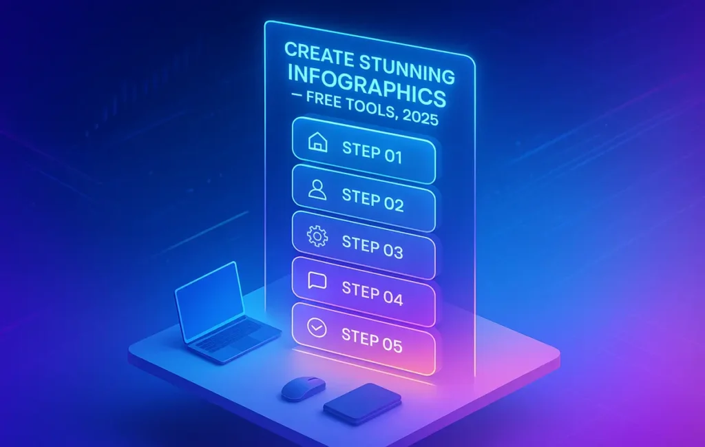
Infographics still dominate attention because they compress complexity into an instantly scannable story. The myth is that you need pricey software or a design degree. In 2025, you don’t. A modern stack of free tools covers planning, data shaping, design, export, and distribution—end to end. In this guide, we’ll walk a practical, step-by-step workflow you can execute today, even if you’ve never designed before. We’ll also highlight where each free tool shines so you can ship beautiful, brand-aligned visuals without friction.
If you’re new to visual frameworks, you can deepen your foundations while you read—our explainer on Designing Infographics breaks down patterns that make complex ideas legible. And if your content ecosystem spans posts, carousels, and quick edits, you’ll find it easy to plug this workflow into your stack alongside Top Online Image Editing Apps for Quick & Easy Edits and Top Content Creation Tools for Social Media for distribution.
💡 Nerd Tip: Skim this guide once, then run it on a small topic (a single feature, a timeline, or a tiny data story). Shipping one good infographic beats planning five perfect ones.
🔎 Why Infographics Still Work in 2025
People don’t share data—they share stories that feel true at a glance. A well-structured infographic provides that first “click of understanding,” which increases the odds of a save, a share, or a link. On platforms where dwell time and completion rate drive reach, a clean visual narrative quietly does both: users linger to parse the story and then pass it along because it’s easy to explain to others.
From a practical standpoint, infographics are also Swiss-army content. The same canvas can become a blog header, a LinkedIn carousel frame set, a short video sequence, an email header, or a downloadable one-pager for lead capture. That multi-format leverage compounds your time investment.
Finally, search engines continue to reward original visuals embedded in high-quality pages. When an infographic clarifies a concept better than the surrounding SERP, it earns embeds and attributions organically—great for authority and long-tail relevance. If you’re optimizing content in parallel, assemble a consistent toolkit using our Content Optimization Toolbox to make on-page enhancements part of your routine.
💡 Nerd Tip: Treat each infographic as a “visual thesis.” One big idea, told cleanly. Everything else (icons, color, layout) exists to support that idea—nothing more.
🧩 Step 1 — Define Your Story & Data (Before You Touch a Tool) 🔷
Start with clarity, not color palettes. Ask: What is my one-sentence takeaway? Your infographic should defend that sentence with a handful of precise elements (numbers, comparisons, steps, or milestones).
Find your narrative spine. Three durable scaffolds cover 90% of use cases:
-
Timeline (How X evolved from A → B → C).
-
Comparison (X vs. Y with decision cues).
-
Process/Framework (Do A → B → C to reach outcome Z).
-
Stats/Insight (Five numbers that change how you think about X).
Gather data with restraint. Data density is not value. Curate inputs to protect readability. If your raw dataset is large, summarize or group it in a spreadsheet first—Google Sheets is perfect here. You can compute small aggregates, percent changes, or rankings, then export charts or simply bring those computed values into your design tool.
Choose the right shape. Let the story dictate the format: timelines want horizontal or vertical tracks; comparisons work well in columnar layouts; processes benefit from numbered steps with directional cues; stats shine in a grid with consistent card styling. The shape is half the design.
💡 Nerd Tip: If you can’t explain your infographic in a 15-second voice note, you’re not ready to design. Simplify the claim or split into two separate visuals.
🛠️ Step 2 — Pick a Free Tool (2025 Options That Actually Deliver) 🟣
The free tier ecosystem has matured. You can design entire campaigns without hitting a paywall, as long as you know each tool’s lane.
| Tool (Free Tier) | Where It Shines | Best Use Case | Typical Workflow Pairing |
|---|---|---|---|
| Canva (Free) | Huge template library, drag-and-drop, quick brand coherence. | Social-ready infographics, quick turnarounds. | Prep charts in Google Sheets → import as PNG/SVG → layout in Canva. |
| Piktochart (Free) | Data-driven blocks, sensible layouts for education/reports. | Teachers, NGOs, internal team reports. | Paste summarized data → use chart widgets → export. |
| Visme (Free) | Clean typography, polished presentation look. | Executive summaries, pitch visuals. | Draft structure in Docs → finalize visuals in Visme templates. |
| Google Charts / Sheets | Accurate charts, easy updates, zero cost. | Data-heavy stories needing exactness and versioning. | Build charts in Sheets → export PNG/SVG → assemble in Canva/Piktochart. |
| Infogram (Free) | Interactive charts and embeds for web pages. | Blog posts needing interactive drill-downs. | Host interactive → capture static thumbnail → embed on site. |
| AI Generators (Text→Infographic) | Rapid first drafts from prompts; great for outlines. | Jump-starting layout or iconography sets. | Prompt a layout → refine static in Canva/Visme → ship. |
When to prefer which:
-
Canva Free is the default for social marketers: speed, templates, brand kits (limited), and easy exports. If you’re bouncing between ideas and need to ship daily, start here. If Canva isn’t your style, scan Free Alternatives to Canva for Quick Graphic Design to pick a tool that feels fast in your hands.
-
Piktochart Free excels with structured data and educators—charts feel at home, and layouts are sensible for reading on a laptop or projector.
-
Visme Free brings polish for reports and stakeholder decks; if your audience is executive-skewed, the typographic defaults will save you time.
-
Google Charts/Sheets wins when accuracy matters and you’ll revise numbers later; no lock-in, no surprises.
-
Infogram Free is worth it when a post benefits from a live, interactive chart (and a static fall-back for social).
-
AI generators (2025) are useful, but treat them as layout assistants. They can hallucinate odd hierarchies or misleading emphasis. Keep human judgment in the loop.
💡 Nerd Tip: Free tiers sometimes watermark or cap exports. If you hit a limit, screenshot at high DPI or recreate the chart in Sheets and place it back into your layout—quality stays crisp and you dodge paywalls.
🎨 Step 3 — Design & Customize Without Clutter 🟡
Start from a template that matches your story shape. If your story is a comparison, pick a split-column base; if it’s a process, pick a step-based layout with ample spacing. Templates are accelerators—edit ruthlessly but keep the bones.
Establish visual grammar early. Choose one headline font and one body font. Lock a color palette: one brand color, one accent, one neutral. If you publish under a consistent banner like NerdChips, use recurring hues and spacing so your infographics look related across posts.
Use icons to reinforce, not decorate. Free icon packs work best when they clarify relationships (e.g., arrows for flow, clocks for time, flags for milestones). Avoid novelty icons that compete with the message.
Respect white space and chunking. Group related items in clearly separated blocks with enough breathing room. Your reader’s eye should glide from top-left to bottom-right without friction. If you find yourself shrinking text below 12px to “fit more,” you’re saying too much.
Typography as hierarchy. Headlines should earn attention but not scream. Subheads cue structure. Body text carries the substance. If a sentence feels crucial, don’t bold the whole paragraph—highlight the key phrase only.
💡 Nerd Tip: Design from the smallest viewport you care about (e.g., mobile width). If it’s legible there, it will sing on desktop.
🚀 Step 4 — Optimize for Sharing, Search, and Speed 🟩
Export formats: PNG for social, SVG for crispness (if the platform supports it), and PDF for printable or downloadable versions. Prepare variants for vertical (Pinterest/LinkedIn), square (X/LinkedIn), and horizontal (blog headers). Keep a master source file so you can iterate fast.
Compress without killing clarity. Run exports through a free optimizer (lossless if possible). This protects page speed, which feeds discoverability. If you’re building a long post that embeds several visuals, lazy-load images and define dimensions to prevent layout shifts.
Accessibility matters. Write concise alt text that states the insight, not “image of chart.” Screen readers should convey the punchline. If your infographic is stats-heavy, include a short textual summary beneath it so no one misses the point.
Metadata and filenames: Descriptive filenames (e.g., ai-marketing-funnel-infographic-2025.png) help image search and organization. Pair with semantic captions in your post for context.
To push reach beyond your site, you can stitch the infographic into a carousel or short motion graphic. Our post on Top Online Image Editing Apps has quick tools that convert frames to lightweight GIF/MP4 variants for social.
💡 Nerd Tip: Create a “Distribution” checklist inside your publishing doc—export sizes, compression, alt text, on-page caption, and social copy. Turning this into a ritual saves mental load.
🔁 Step 5 — Distribute & Repurpose Like a Pro 🟦
Platform-fit matters. On LinkedIn, convert the infographic into a 6–9 frame carousel, each frame holding one micro-insight. On X, lead with a hook + one cropped panel; thread the rest. On Pinterest, go tall; on your blog, embed the full canvas and add a short explanatory section for SEO.
Slice for longevity. Break the visual into components: a single chart, a comparison block, a quote card, a definition. Schedule these over 2–4 weeks. Each slice points back to the canonical blog post where the full infographic lives.
Email leverage. Drop a reduced version into your newsletter with a “view full size” link on your site. Email readers often save or forward high-utility visuals—it’s a quiet compounding effect that pays off in months, not days.
Internal linking for context. When you publish an infographic that explains a process, link to a deeper explainer or a tooling post at the natural decision point. For example, if your visual covers social graphics, steer readers to Top Content Creation Tools for Social Media for execution. If you outline a data workflow, tie into Content Optimization Toolbox where readers can operationalize audits and checks.
💡 Nerd Tip: Always end your post with one “next step” link. Readers who finish a visual are primed to act—don’t leave them guessing what to do next.
⚡ Ready to Build Smarter Workflows?
Automate the boring parts of your content pipeline. Connect research → Sheets charts → design exports using AI workflow tools. Start automating in minutes—no coding, just creativity.
🧪 A Practical Workflow (Idea → Data → Free Tools → Output) 🟠
-
Idea: “Show a 5-step content repurposing loop.”
-
Data: No heavy numbers—just a validated sequence. Draft bullets in Docs; refine in Sheets if steps depend on time/cost.
-
Structure: Choose a process layout with five panels and directional arrows.
-
Design (Free):
-
Build simple icons (upload or pick from the free library).
-
Lock brand palette (primary color for steps, neutral for text).
-
Add a compact title and a one-line subtitle that states the payoff.
-
-
Export: Square for X/LinkedIn carousel frames, vertical for Pinterest, PNG for blog.
-
Distribution: Blog first (canonical), then social slices over two weeks, then a recap email with the full visual.
-
Measure: Track saves and shares; on-page, watch scroll depth and image clicks.
If you need deeper design principles while executing this, dip into Designing Infographics as you build—treat it like a checklist to spot readability traps early.
💡 Nerd Tip: Create one “evergreen base” infographic per quarter that stays relevant for 12+ months, then do monthly topical spinoffs that remix 30–40% of the base.
⚠️ Pitfalls & Simple Fixes 🟥
Overcrowding. If you’ve got eight ideas on one canvas, you’ve got two infographics pretending to be one. Split them and both will perform better.
Inconsistent styling. If a viewer can spot three different font families, your hierarchy is leaking. Set global styles up front (H1/H2/Body) and stick to them.
Chart junk. Three-dimensional bars, heavy borders, and loud gradients reduce trust. Flatten your visuals. Let contrast do the work.
Free tier limits. When exports cap size or watermark appears, rebuild the chart in Google Sheets and import it back to your layout. You’ll keep quality and control.
AI layout drift. Text-to-infographic tools can misprioritize sections. Use them to draft a skeleton, then re-establish hierarchy manually.
💡 Nerd Tip: Do a “20-second test.” Show your draft to a teammate. If they can’t tell you the point in 20 seconds, revise the title or restructure the blocks.
🧰 Mini “Free-Only” Stack You Can Reuse Weekly 🧵
-
Planning: Google Docs for outline, Sheets for data cleaning and chart generation.
-
Design: Canva Free (or your chosen Canva-alternative), with a reusable brand kit (even minimal).
-
Icons/Illustrations: Free packs (consistent line weight).
-
Export & Compression: Built-in exporter → free compressor.
-
Distribution: Blog first (canonical), then social carousels and an email embed.
When you’ve got a stack you trust, production becomes muscle memory—your energy goes to story quality. This is the exact flywheel NerdChips uses when we need to turn complex research into something readers can share in seconds.
📬 Want More Smart AI Tips Like This?
Join our free newsletter and get weekly insights on AI tools, no-code apps, and future tech—delivered straight to your inbox. No fluff. Just high-quality content for creators, founders, and future builders.
🔐 100% privacy. No noise. Just value-packed content tips from NerdChips.
🧭 Read Next
When you choose your toolset, think beyond the canvas. If you need a deeper dive on visual grammar, pause here and study Designing Infographics to avoid common readability traps. Once your first draft is ready, run tiny edits through Top Online Image Editing Apps so your social crops look clean. For social rollout, layer this with the playbook we outlined in Top Content Creation Tools for Social Media to streamline captions and scheduling. And if you’re optimizing your broader content library, bookmark Content Optimization Toolbox to reinforce on-page structure as your visuals scale.
🧠 Nerd Verdict
The winning pattern in 2025 isn’t “perfect art”—it’s repeatable clarity. Free tools now cover 95% of what solo creators and small teams need to tell a credible, attractive visual story. Your leverage comes from a ritualized workflow: define one crisp claim, align the shape to the story, build charts where accuracy matters (Sheets), assemble in a layout tool (Canva/Piktochart/Visme), export multiple aspect ratios, and distribute deliberately over weeks, not hours. If you stick to this loop, your infographics stop being one-offs and start becoming assets that educate, attract links, and compound reach across your entire content system.
❓ FAQ: Nerds Ask, We Answer
💬 Would You Bite?
What topic from your niche deserves a clear, one-screen explanation right now?
Tell me your one-sentence claim and I’ll map it to the best free tool + layout. 👇
Crafted by NerdChips for creators and teams who want their best ideas to travel the world.