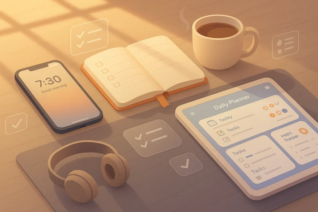
🧠 Why Design Quality Matters Even If You’re Not a Designer
In the age of instant visual judgment, your design quality can make or break your content before a single word is read. Studies show that users form an opinion about a webpage or social media post in just 0.05 seconds. That’s faster than the blink of an eye—and it’s purely visual. A graphic that looks professional immediately signals trustworthiness, authority, and attention to detail. Conversely, clumsy layouts, mismatched fonts, and poor image quality suggest carelessness, making it harder for your message to be taken seriously.
For example, imagine two Instagram posts promoting the same webinar. One uses a generic screenshot with cluttered text and unbalanced colors. The other follows basic design principles—clear hierarchy, harmonious colors, and breathing space between elements. Even if the second post’s content is identical, it will almost always perform better because the design communicates credibility and clarity.
Great design doesn’t just “look nice”—it influences action. Whether you want clicks on a link, downloads of a lead magnet, or conversions from a sales page, the design is part of your conversion engine. If you’ve ever wondered why some creators gain traction faster, their design quality often plays a major role.
💬 Nerd Insight: You don’t need a formal design degree to create professional-looking visuals. You just need to understand the key principles and use the right tools—something we’ll unpack in the next sections.
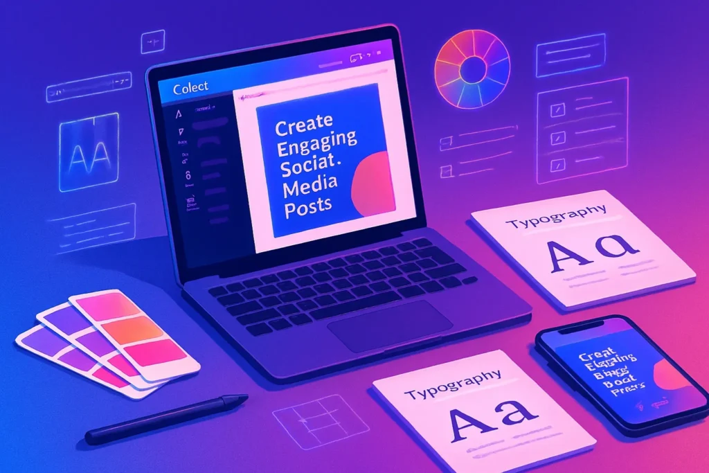
🎨 Core Design Principles for Non-Designers
Design isn’t magic—it’s structure. The three principles below form the backbone of most professional visuals, whether it’s a social post, a blog graphic, or an ad banner.
✅ Color Theory Basics
Color is one of the most powerful emotional triggers in design. The right palette can set the tone—warm, cool, playful, or serious—and influence how your brand is perceived.
Understanding color harmony means knowing which colors complement each other and which clash. Beginners can start with tried-and-tested combinations from tools like Coolors or Adobe Color. For example:
-
Complementary colors (opposite on the wheel) create high contrast.
-
Analogous colors (next to each other) feel harmonious and subtle.
The key is restraint—stick to a primary color, one or two secondary colors, and a neutral background tone.
✅ Font Pairing
Fonts are more than decoration—they carry personality. Serif fonts often feel formal and traditional, while sans-serifs are clean and modern. Script fonts can be elegant or playful, but should be used sparingly. The golden rule for non-designers? Limit yourself to two fonts: one for headings, one for body text.
A practical pairing example:
-
Heading: Montserrat Bold (modern, bold)
-
Body: Open Sans Regular (clean, easy to read)
You’ll notice this rule applied in many high-performing websites—including those in our Top Content Creation Tools for Social Media guide.
✅ Whitespace
Whitespace (or negative space) is the oxygen of your design. It’s the empty area around elements that helps them breathe and be understood. Without enough whitespace, your design feels cramped; too much, and it can feel disconnected. The balance makes the difference between clutter and elegance.
⚙️ Leveraging Easy-to-Use Tools
Professional design used to require mastery of complex tools like Photoshop or Illustrator. Today, platforms like Canva have democratized design. Even without advanced skills, you can create scroll-stopping visuals in minutes.
Canva for Beginners
Canva offers drag-and-drop simplicity, pre-made templates, and a vast library of elements. For non-designers, the key is customization—don’t just use a template as-is. Swap colors to match your brand, replace stock images with originals, and adjust font sizes for readability.
Alternative Tools Worth Trying
-
Crello (VistaCreate): Similar to Canva, with some unique animated templates.
-
Adobe Express: Great for quick branded content creation with high-quality fonts.
-
Figma Templates: For those ready to experiment with slightly more advanced layouts.
📚 Free & Paid Resources for Templates and Inspiration
Creativity thrives on inspiration. If you’re not sure where to start, these resources can spark ideas and save hours.
Free Resources
-
Unsplash and Pexels: High-quality stock photos for backgrounds or accents.
-
Freepik: Vectors, icons, and illustrations for almost any topic.
-
Canva Free Templates: Perfect starting points.
Paid Premium Resources
-
Envato Elements: Unlimited downloads of templates, stock images, and fonts.
-
Creative Market: Fonts, templates, and mockups sold individually.
-
Design Cuts: Discounted bundles for serious creators.
💡 A non-design trick? Study trending graphics in your niche. You’ll see recurring patterns—minimalist layouts, pastel palettes, bold typography—that you can adapt for your brand.
🛠 Practical Tips for Better Visuals
Even with great tools and resources, execution matters.
-
Use grids to align elements—Canva has a built-in grid and ruler feature.
-
Limit your palette and fonts to create a consistent look.
-
Keep text short; let visuals tell most of the story.
-
Preview your design on both desktop and mobile—elements that look balanced on a large screen can feel cramped on a phone.
These tips echo the workflow we outlined in Designing Infographics, where structure and consistency determine clarity.
🚫 Common Mistakes to Avoid
New creators often make the same visual missteps:
-
Overloading designs with too many colors, fonts, or elements.
-
Using low-resolution images that appear pixelated.
-
Copying templates without customizing for their brand.
-
Ignoring text alignment or spacing.
Remember: good design feels intentional. If something looks “off,” it probably is.
📬 Want More Design Tips Like This?
Join our free newsletter for weekly tips on creating pro-level visuals, mastering Canva, and boosting your brand presence—without a design degree.
🔐 100% privacy. No spam—just actionable, value-packed tips from NerdChips.
✅ Quick Design-Ready Checklist
“Design Ready in 5 Minutes”
-
Select 1 main color, 1 accent, and 1 neutral.
-
Choose 2 fonts and apply them consistently.
-
Align elements using grid lines.
-
Leave generous whitespace.
-
Test readability on mobile.
✅ Brand Consistency in Design – The Invisible Trust Builder
One of the easiest ways for non-designers to appear instantly professional is to stick to consistent brand visuals across all platforms. Brand consistency isn’t just about looking good—it’s about becoming recognizable at a glance.
When your colors, fonts, and visual styles stay the same across your website, social media posts, and marketing materials, you’re training your audience to remember you. A mismatched design strategy (different fonts in every post, changing color palettes weekly) creates visual noise and weakens brand trust.
Practical tips for instant consistency:
-
Choose 2–3 main brand colors and 1–2 accent colors.
-
Select 1 primary font for headings and 1 for body text.
-
Use the same style of icons, illustrations, and photography filters.
💡 Nerd Tip: “If someone saw your graphic without a logo, would they still know it’s yours?”
🧠 Accessibility in Design – Make Your Graphics Inclusive
Beautiful design is useless if people can’t read or understand it. Accessibility ensures your visuals reach everyone—including people with vision impairments or different screen setups. This isn’t just a “nice to have”—it’s a legal and ethical consideration in many countries, and it also improves SEO.
Key accessibility tips:
-
Maintain a text-to-background contrast ratio of at least 4.5:1 for body text.
-
Use font sizes of 16px or larger for readability.
-
Avoid overly decorative fonts for long passages.
-
Always include descriptive alt text for graphics, especially if they convey key information.
🌍 A well-designed, accessible graphic not only expands your reach but also sends a clear message: your brand cares about every viewer.
🔄 Repurposing Visual Assets – Work Smarter, Not Harder
If you’ve spent hours making a beautiful Instagram post, don’t let it live and die there. Repurposing lets you adapt a single design into multiple formats—Instagram carousel, LinkedIn post, Pinterest pin, YouTube thumbnail—while keeping your brand identity intact.
This approach saves time, maintains design consistency, and boosts your presence across different platforms without reinventing the wheel each time.
Example workflow:
-
Core Design: Create a master 1080×1080 square post in Canva.
-
Resize for Platforms: Use Canva’s “Magic Resize” to create vertical (1080×1920) for Stories/Reels, horizontal (1920×1080) for YouTube/Facebook, and vertical pins for Pinterest.
-
Adjust Content: Swap out text sizes and reframe images to fit the context, but keep the color palette and font pairing the same.
🖌️ Design Workflow for Non-Designers – From Idea to Publish
Even without formal training, you can build a professional-looking design every time by following a simple process:
-
Define Purpose: Decide the goal of your design—educating, promoting, inspiring.
-
Choose Template: Start from a relevant Canva or Adobe Express template.
-
Apply Brand Assets: Insert your brand colors, fonts, and logo.
-
Organize Content: Use grids to align text and images. Keep spacing consistent.
-
Test Readability: Preview on both desktop and mobile to ensure nothing looks cramped or blurry.
-
Export & Share: Save in high resolution (PNG for images, MP4 for animations) and upload to the right platform.
By making this a repeatable checklist, you’ll cut design time in half and avoid guesswork.
💬 Mini Case Study – From Amateur to Professional Look Overnight
Before: A small coaching business created social media posts with mismatched colors, random stock images, and inconsistent font styles. Their engagement rate hovered around 1.2%, and followers often skipped over their posts.
After Applying These Tips: They chose a calm teal-and-gold color palette, paired Montserrat (headings) with Lato (body text), and created a Canva template for all posts. They began repurposing designs for multiple platforms and optimized contrast for readability.
Result: Engagement jumped to 4.8% in three months, followers started sharing posts, and brand recognition improved dramatically. They even reported getting more client inquiries from people who “loved their professional look.”
🧠 Nerd Verdict
Even without formal training, you can produce designs that look like they came from a pro studio. The secret is understanding the fundamentals, using the right tools, and staying consistent. Every visual you publish is a brand statement—make sure it’s saying the right thing.
❓ FAQ: Nerds Ask, We Answer
💬 Would You Bite?
If you could only keep one design tool for your content creation, which would it be—and why? Drop your pick in the comments below.