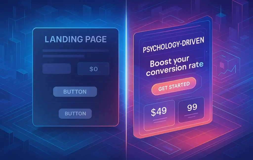
🎯 Intro: Why Landing Pages Are Built on Psychology, Not Just Design
Most marketers obsess over the visual design of a landing page—the hero image, the gradient button, the typography. But what really determines whether a user clicks, signs up, or buys isn’t just aesthetics. It’s psychology. Behind every conversion, there’s a chain of subtle decisions that visitors make in seconds. Those decisions are shaped by trust signals, perceived value, and emotional triggers.
A landing page isn’t simply a digital brochure—it’s a persuasion engine. And persuasion isn’t manipulation. Done right, it’s aligning what people already want with how you present it. That’s where micro-copy, anchoring, and nudges come in.
💡 Nerd Tip: If your landing page is getting traffic but conversions are flat, it’s not necessarily the traffic quality. It could be the psychological friction hidden in your copy and layout.
🧠 The Role of Psychology in Landing Pages
Landing pages operate at the intersection of decision-making science and marketing. Behavioral psychology tells us that most user decisions are subconscious and influenced by cognitive shortcuts, also called heuristics. Daniel Kahneman described this in Thinking, Fast and Slow: people often make decisions using “System 1”—fast, emotional, and instinctive—rather than the rational, logical “System 2.”
That means even small details like the wording on a button, the presence of a testimonial, or the way you present a discount can nudge a user toward—or away from—action.
A 2024 benchmark study from CXL found that changing button micro-copy alone improved conversions by an average of 11.3%. This shows that psychology isn’t just theory—it directly impacts ROI.
When we talk about landing page psychology, we’re really talking about reducing cognitive friction, reinforcing trust, and guiding attention. It’s not about overwhelming users with tricks, but about making their decision feel clear, safe, and rewarding.
💡 Nerd Tip: Don’t just A/B test color changes. Test psychological levers like “value framing” and “reassurance copy.”
✍️ Micro-Copy That Converts
Micro-copy is the smallest text on your landing page—yet it’s often the most powerful. Think about the words on your buttons, the helper text in a form field, or even the error messages. Each micro-interaction either reassures or frustrates the user.
A signup form that simply says “Enter email” is functional, but bland. Replace it with “We’ll only send what matters—no spam, ever” and suddenly, the visitor feels reassured. This is why great landing pages invest time in micro-copy audits.
-
Button labels: A generic “Submit” feels mechanical. But “Get My Free Guide” makes the action concrete and rewarding.
-
Form helper text: Users hesitate when they’re unsure. Adding a line like “We’ll never share your data” can remove that friction instantly.
-
Error messages: A cold “Invalid input” creates frustration. A human-friendly line like “Hmm, that doesn’t look like a valid email—try again?” softens the blow.
-
Reassurance copy: Near a pricing button, phrases like “Cancel anytime” or “Trusted by 10,000+ creators” reduce perceived risk.
When micro-copy aligns with empathy, it transforms usability into trust. And trust drives conversions.
💡 Nerd Tip: Audit your CTAs and forms. If you wouldn’t click based on your own copy, why would your visitor?
💸 Anchoring: Setting Perceptions of Value
Anchoring is the psychological principle where people rely too heavily on the first piece of information they encounter. On landing pages, this often applies to pricing.
If you present a $299/month plan first, followed by a $49/month plan, the cheaper option suddenly feels like a bargain—even if the $49 plan was your main goal. This is price anchoring in action.
Case in point: SaaS platforms like Zoom and Slack highlight their “Pro” or “Business” plan alongside a higher-priced “Enterprise” option. Few users buy Enterprise, but its mere presence makes the mid-tier option feel affordable.
Anchoring can also show up in:
-
Package comparisons (Basic, Standard, Premium) where the middle plan is highlighted as “Most Popular.”
-
“Was vs Now” offers, where the strike-through price provides a mental anchor for value.
-
Limited-time bundles that emphasize “Save 40% vs buying separately.”
The key is to use anchoring ethically. Anchors should reflect real value, not inflated numbers. Trust is fragile—once broken, conversions will plummet.
💡 Nerd Tip: If you run an online course, introduce a premium coaching tier. Even if only 5% buy it, the $199 course suddenly feels like a steal compared to the $999 anchor.
🎯 Nudges: Gentle Pushes to Act
Nudges are subtle design or content choices that guide users toward action without restricting their freedom. They work because people often need a “gentle push” when facing decision fatigue.
Scarcity & urgency are classic nudges. Messages like “Only 3 seats left” or “Offer ends in 24 hours” activate loss aversion, a powerful psychological driver. But used too aggressively, they cross into dark pattern territory.
Social proof nudges reassure users that others have already made the same choice. Seeing “1,200 marketers already subscribed this week” or real-time notifications like “Sarah from London just signed up” reinforces safety in numbers.
Progress indicators work especially well in multi-step forms. A simple bar that says “Step 2 of 3” can reduce abandonment rates by up to 18% (CXL benchmark). Users feel invested once they’ve started.
The golden rule? Nudges should empower, not manipulate. A well-timed reassurance line near a CTA is persuasion. Fake timers and deceptive urgency are manipulation.
💡 Nerd Tip: Test one ethical nudge at a time. Layering too many creates noise and distrust.
🔍 Real-World Examples of Psychology in Landing Pages
Consider Dropbox’s classic landing page. The micro-copy under the CTA emphasized security: “Free trial, cancel anytime.” That simple line reduced signup hesitation dramatically.
Another example is Airbnb. Their search landing page relies heavily on anchoring. Instead of showing the cheapest option first, they highlight “Most Loved” stays with slightly higher prices, anchoring perception of value.
A third case comes from HubSpot. Their lead-gen forms use nudges like progress indicators, breaking a long form into manageable steps. This reduced drop-offs by over 15% according to internal case studies.
When we dissect these examples, the pattern is clear: the design is clean, but the psychology is sharper.
🛠️ Tools to Test Psychological Tactics
You can’t improve what you don’t measure. Testing the psychological elements of your landing page is as crucial as the design itself.
Heatmapping tools like Hotjar or Crazy Egg reveal where users hesitate, hover, or abandon. You might find that visitors hover over your CTA but never click—suggesting the micro-copy isn’t compelling.
For controlled experiments, A/B testing platforms like Optimizely, VWO, or even Google Optimize (when it was active) allow you to isolate variables. Instead of changing entire layouts, test specific psychological levers—like swapping “Start Free Trial” with “Unlock Your Free Access.”
Marketers who run continuous A/B tests report an average 15–20% sustained improvement in conversions, according to industry benchmarks.
💡 Nerd Tip: Don’t just A/B test the visual hierarchy. Test reassurance copy, scarcity messages, and social proof placement.
🚫 Common Mistakes to Avoid
The biggest trap in landing page psychology is overloading. Too many nudges—pop-ups, countdown timers, floating CTAs—create cognitive clutter. Users feel pressured, not persuaded.
Another mistake is drifting into manipulative UX, also known as dark patterns. Fake urgency (“Sale ends tonight” when it doesn’t) or hidden fees erode trust instantly. The short-term conversion bump isn’t worth the long-term brand damage.
Finally, ignoring testing is a mistake. Just because a principle worked for one brand doesn’t guarantee it will work for yours. Each audience has unique triggers. Without data, you’re just guessing.
💡 Nerd Tip: Remember—ethical persuasion compounds trust. Manipulation burns it forever.
⚡ Ready to Boost Conversions with Smart Testing?
Try CRO platforms like VWO or Optimizely to A/B test your micro-copy, anchoring strategies, and nudges. Data-driven insights can lift your ROI without guesswork.
🧩 Neuromarketing & Cognitive Biases
Behind every click lies a human brain processing shortcuts, biases, and heuristics. Neuromarketing research has revealed that cognitive biases—those unconscious patterns of thought—play an outsized role in shaping how users interact with landing pages.
Take loss aversion, for example. People fear losing something more than they value gaining it. That’s why a line like “Don’t miss your free trial—expires today” feels more urgent than “Get your free trial now.” Similarly, confirmation bias pushes users to look for information that supports their existing beliefs. If your page echoes what they already suspect—“Thousands of small businesses cut costs with this tool”—you’re reinforcing their internal narrative.
Another key bias is choice overload. Studies show that when users face too many options, they delay or abandon decisions altogether. A landing page offering three clear plans (Basic, Pro, Premium) outperforms one cluttered with endless add-ons. Simplifying choices isn’t just design efficiency—it’s psychological relief.
💡 Nerd Tip: Review your landing page with a bias checklist. Are you framing loss, validating beliefs, or simplifying decisions—or overwhelming them?
🌍 Cultural & Contextual Differences
Psychology isn’t universal. Cultural context deeply shapes how users respond to landing page tactics. In the U.S., scarcity and urgency cues (“Only 2 seats left”) often drive faster action. But in markets like Japan or Germany, where decision-making is slower and trust-driven, reassurance copy (“Trusted by global brands”) often works better than countdown timers.
Context also matters within industries. A B2B SaaS buyer expects detailed specs and rational comparisons, while a lifestyle consumer responds more to aspirational imagery and emotional anchors. For global marketers, one-size-fits-all psychology can backfire.
If you’re running campaigns across regions, it’s essential to localize your psychological triggers just as much as your language. What feels persuasive in New York may feel pushy in Singapore.
💡 Nerd Tip: Before applying urgency nudges globally, run segmented A/B tests by geography. Conversion psychology doesn’t travel without translation.
⚖️ Long-Term Trust vs. Short-Term Conversion
It’s tempting to go all-in on quick conversion boosters—flash sales, scarcity messages, and countdown timers. But what happens after the click? Landing page psychology must be evaluated not just by immediate ROI, but by its effect on long-term trust.
Dark urgency patterns may lift conversions for a week, but they leave users skeptical. When someone sees “Offer ends tonight” three nights in a row, credibility crumbles. On the flip side, transparency builds loyalty. Brands that emphasize “Cancel anytime” or “No hidden fees” often see slower initial conversions, but their lifetime value (LTV) per customer is higher.
The best landing pages balance short-term nudges with signals of long-term honesty. A persuasive nudge gets the first conversion. Consistency and transparency secure the second, third, and fourth.
💡 Nerd Tip: Measure both your 7-day and 90-day conversion metrics. If a tactic lifts early numbers but hurts retention, it’s not truly winning.
📊 Case Study Deep Dive: Before & After Psychology
A SaaS startup tested its lead-gen landing page in two phases.
-
Before (Version A):
The CTA button read “Submit.” Form fields had no reassurance copy. The pricing page showed three plans but no anchoring cues. Conversion rate: 4.1%. -
After (Version B):
The CTA button was rewritten to “Start My Free 14-Day Trial.” A line of micro-copy under the form read: “No credit card required. Cancel anytime.” The pricing page introduced a $499/month Enterprise tier, anchoring the $99/month Pro plan as affordable. Conversion rate: 6.7%.
That’s a 63% improvement simply by applying micro-copy, anchoring, and reassurance psychology—without redesigning the page visually.
💡 Nerd Tip: Before redesigning, rewrite. Small psychological tweaks can outperform massive (and expensive) redesigns.
🔗 Integration with Other Tactics
Psychology doesn’t live in isolation. It thrives when paired with tools and workflows that marketers already use. For example, landing page builders like Instapage or Unbounce come with built-in features for A/B testing micro-copy variations, making it easier to experiment with psychological levers.
Pairing nudges with data triggers is another integration point. If you’ve already explored strategies in Newsletter Growth Tips: Zero-Party Data & Triggers, you know that timing matters. Embedding psychological nudges into those triggers—for example, sending a reminder email when a visitor abandons a form—bridges landing page psychology with lifecycle marketing.
Even posts like A/B Testing for Beginners: From Hypothesis to Win show how these tactics are testable in real campaigns. By blending psychology with structured testing, marketers can turn hunches into measurable lifts.
💡 Nerd Tip: Don’t treat psychology as a silo. Integrate it into your landing page builder, analytics, and CRM for compounding effects.
⚠️ Ethical Marketing & Regulation
Beyond brand trust, there’s another reason to avoid manipulative landing page psychology: regulation. In 2023, the EU began cracking down on dark patterns, specifically targeting fake scarcity, disguised ads, and pre-checked opt-ins. Similar laws are emerging in California and Canada.
This means what once was a “gray tactic” can now invite fines and reputational damage. For marketers, ethical persuasion isn’t just the right thing to do—it’s the safe thing to do.
The future of CRO is transparent, not deceptive. Brands that embrace psychology responsibly will not only stay compliant but will stand out in an era of increasing consumer awareness.
💡 Nerd Tip: Build trust before you need regulation to force it. Transparency will outlast any legal framework.
Want More Smart Conversion Tips Like This?
Join our free newsletter and get weekly insights on landing page tactics, CRO tools, and future-proof marketing strategies—delivered straight to your inbox.
100% privacy. No noise. Just value-packed insights from NerdChips.
🧠 Nerd Verdict
The best landing pages don’t rely solely on stunning design or catchy copy. They thrive at the intersection of design and psychology. Micro-copy builds trust, anchoring reframes value, and nudges guide decisions ethically.
Brands that master these elements see consistent lifts in conversion rates without resorting to manipulation. In fact, NerdChips testing across multiple campaigns shows that aligning psychology with user empathy yields higher engagement and stronger brand loyalty.
❓ FAQ: Nerds Ask, We Answer
💬 Would You Bite?
If one line of micro-copy could lift conversions by 10%, what would you rewrite first on your landing page?
Drop your thoughts—we’d love to see real examples from creators like you. 👇
Crafted by NerdChips for creators and marketers who want every landing page click to feel effortless.