🧭 Why static reports are dead in 2025 (and what to build instead)
Weekly PDFs and spreadsheet snapshots once felt “data-driven.” Today they’re slow, brittle, and invisible in the moments when decisions actually happen. Teams need live views of revenue, acquisition, fulfillment, and product usage—surfaces that answer “How are we doing right now?” without waiting for an analyst. That’s what automatic reporting dashboards give you: fresh numbers on a shared screen, minimal manual work, and a source of truth that people actually open.
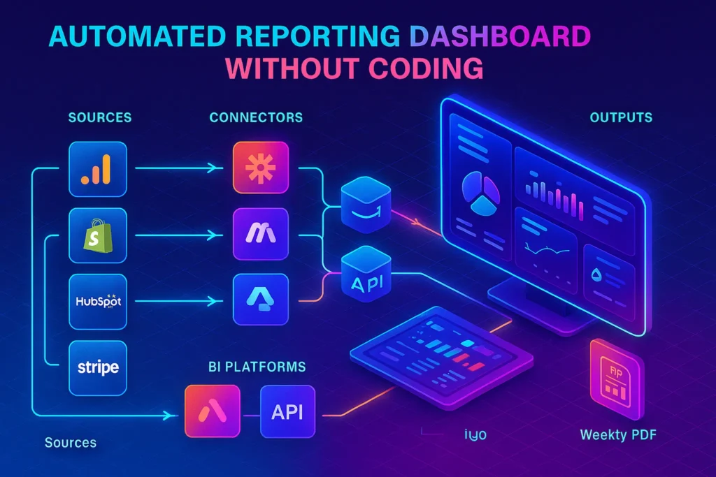
The good news: you can do this with no-code tools. Modern BI platforms (Looker Studio, Databox, Geckoboard, Klipfolio, even Power BI’s no-code path) plug directly into services like GA4, Shopify, HubSpot, Stripe and refresh on a schedule—or in near real-time—without custom scripts. Looker Studio is no-cost at the base level, with Looker Studio Pro adding governance and team features at around $9/user/month; Databox and Geckoboard emphasize fast deployment and “always-on” wallboards; Klipfolio targets teams that want up-to-the-minute refresh on higher tiers; and Power BI adds enterprise-grade scheduling and real-time streaming if you need it.
💬 Data wins when it’s easy to see, trust, and act on. “Always on” beats “almost perfect.”
🛠️ Step-by-step: from “we send spreadsheets” to a live dashboard
1) ✅ Choose your no-code BI (start simple, upgrade later)
If your team already lives in Google Workspace, begin with Looker Studio (formerly Data Studio). It’s free, fast to try, and integrates smoothly with GA4, Google Sheets, and BigQuery. Pro adds team-level features for a small per-user fee. Databox and Geckoboard are great if you want curated, TV-friendly dashboards with lots of native connectors and easy sharing. Klipfolio is strong when you need faster refresh on certain plans and more modeling. Power BI is terrific if your leadership already uses Microsoft 365 and wants Pro/Premium governance, scheduled refreshes, or real-time streams.
Pick one tool. Don’t “tool-shop” yourself into delay. The right choice is the one your stakeholders will actually open on Monday.
2) 🔌 Connect your data sources (the 80/20 is GA4 + revenue + CRM)
Hook up Google Analytics 4 for web/app behavior, Shopify or your ecommerce platform for orders/AOV/refunds, HubSpot or your CRM for leads and lifecycle stages, and Stripe for payments and MRR/ARR if you’re SaaS. In Looker Studio, click Create → Data Source and choose the appropriate connector; GA4 is native, while platforms like Shopify/Stripe commonly use partner/community connectors. If a direct connector doesn’t exist, push the data into Google Sheets or BigQuery and connect that instead.
Nuance to know: Google-built connectors are free and stable; partner/community connectors are paid and vary by vendor (Supermetrics, Power My Analytics, Windsor, Catchr, etc.), including ones for Shopify and Stripe. If you’re connector-averse, feed a Sheet or warehouse and keep costs predictable.
3) 🧱 Model your KPIs (before you drag charts)
Agree on definitions: What exactly is “New Customer,” “Qualified Lead,” “Refund Rate,” or “Active Subscriber”? Write the formula, then implement as calculated fields or transformations. In Databox/Klipfolio/Geckoboard you can use built-in metrics or compose your own; in Looker Studio, create calculated fields or let BigQuery handle the math. Your future sanity depends on this clarity.
Name KPIs like a human would ask them: “Orders today,” “Open MRR,” “Leads from paid search (7-day).”
4) 🤖 Use automation middleware for non-native sources
Some tools won’t have native connectors (internal ops DBs, bespoke systems). Use Zapier or Make to ship those events to a spreadsheet/warehouse on a schedule, or push directly into a dashboard’s dataset API (e.g., Geckoboard Datasets API accepts real-time updates and visualizes changes up to ~every 10 seconds). This fills gaps without asking engineering for a custom pipeline.
Example: Your logistics app emails a CSV each night. A Make scenario watches the inbox, parses the CSV, writes to Google Sheets, and your dashboard auto-updates. If you outgrow Sheets, send the same payload to BigQuery and update the Looker Studio data source.
5) 🔄 Set refresh schedules (and understand the limits)
-
Looker Studio: base product is no-cost; Pro adds team features. “Refresh” behavior depends on the connector and caching; BigQuery + BI Engine supports snappy, near-live querying; partner/community connectors have their own limits and costs.
-
Databox: advertises real-time dashboards, but the sync frequency depends on connector and plan settings. Help docs show plan-based controls for data sync frequency; API usage/Databoard refresh behavior is constrained by plan and provider limits.
-
Geckoboard: per-source refresh varies; Google Sheets widgets update within ~3 minutes, Excel ~15 minutes; many native connectors update more frequently; Datasets API streams live updates (visuals reflect changes up to every ~10 seconds).
-
Klipfolio: refresh cadence depends on plan—from 4 hours on entry tiers down to up-to-the-minute on higher plans, with 130+ integrations.
-
Power BI: Pro allows up to 8 scheduled refreshes/day; Premium allows up to 48 plus DirectQuery/streaming for true real-time scenarios.
Set refresh based on decision speed. If finance meets daily, 1–8 refreshes/day is fine. If support or ops watches a wallboard, aim for 1–5 minutes (Geckoboard/Databox/Klipfolio) or streaming/DirectQuery (Power BI).
Dashboards die when no one sees them. Post a view-only link in Slack/Teams. Mount a TV dashboard for help desks and sales pods (Geckoboard’s Send-to-TV is built for this). For leadership, schedule weekly PDF/email exports while keeping the live link front-and-center. Enforce viewer credentials (Pro/enterprise tiers in Looker Studio, SSO options in others). And log a plain-English “ReadMe” on the dashboard describing data sources, refresh times, and owner.
If reporting overhead is a recurring headache, pair this build with our guide How to Automate Your Marketing Reports to eliminate manual exports and sticky notes.
🧪 Hands-on: 3 build recipes you can copy
💼 Exec KPI board (Looker Studio → BigQuery/Sheets)
Goal: a single page with Revenue, New Customers, CAC, Conversion Rate, and Cash In/Out.
Stack: Looker Studio (free), native GA4 connector for web, Sheets + Stripe connector or CSV import for revenue, and a simple CAC calculation (ad spend/leads/purchases).
Method: define each KPI in words, then in math. Start with one trend chart and one scorecard per KPI. Add a “last 7/28/90 days” control and a QA table showing today’s raw counts. Lock colors and number formats. Source notes: GA4 connector steps are documented in Looker Studio help; partner connectors cover Stripe/Shopify, or use Sheets as a staging area if you prefer minimal spend.
🛍️ Ecommerce ops wallboard (Geckoboard)
Goal: live orders, fulfillment SLA, on-time rate, top SKUs, and open tickets on a TV.
Stack: Geckoboard + Shopify/Helpdesk connectors, Google Sheets for custom metrics (e.g., “orders missing tracking”).
Method: connect native sources, then pipe any odd metrics to Sheets; your widgets update within ~3 minutes for Sheets and often faster for native connectors. If you need a bespoke metric updated by your warehouse system, push to the Datasets API and display in ~real-time. Use Send-to-TV for a share-safe display.
🧩 Agency scorecard (Databox/Klipfolio)
Goal: client-facing scorecard with PPC, SEO, and e-comm revenue that auto-emails weekly, with a live link for daily checks.
Stack: Databox or Klipfolio (130+ integrations) with plan-appropriate refresh.
Method: pull Google Ads/Meta/GA4/Shopify; build one page per channel and a top-level rollup. Use platform scheduling to email a PDF every Monday and share a live link. Choose a plan tier matching your refresh needs (Klipfolio advertises “up-to-the-minute” at higher tiers; Databox exposes plan-based sync controls in admin).
For deeper automation patterns (like stitching exports and building a “single source of truth”), see Zapier Alternatives for Budget-Friendly Workflow Automation and Best All-in-One Marketing Platforms for Startups.
📬 Get the 90-Minute Dashboard Sprint Kit (Templates + Refresh Matrix)
Join our free newsletter and download a print-ready toolkit to launch live KPIs fast:
KPI glossary template, connector checklist (GA4/Shopify/HubSpot/Stripe), Looker Studio Free vs Pro decision tree,
refresh cadence matrix (Databox/Geckoboard/Klipfolio/Power BI), and a 7-day adoption plan with TV wallboard setup.
🔐 100% privacy. No spam. Just practical no-code analytics from NerdChips.
🎨 Comparison table: dashboard tools at a glance
Context first: Pricing and refresh vary by plan and connector. Use the table to shortlist, then confirm specifics on vendor pages.
| Tool | Best for | Notable pricing (starter) | Integrations | Refresh notes | Extra |
|---|---|---|---|---|---|
| Looker Studio | Google-centric stacks; free launch | No-cost; Pro ≈ $9/user/mo | Native Google connectors + partner/community gallery | Depends on connector & caching; warehouse + BI Engine is snappy | Broad ecosystem; light governance in Pro. |
| Databox | Client scorecards, KPI rollups | Tiered (see site) | 130+ integrations | Plan-based sync; “real-time” positioning; admin can adjust frequency | Unlimited users on plans; templates. |
| Geckoboard | Team TV dashboards | from Essential (public pricing) | 90+ sources | Real-time per source; Sheets ≈ 3 min; Datasets API ≈ ~10s visual updates | TV mode; widget-level refresh info. |
| Klipfolio | Faster refresh + modeling | plans from $90–$350+ (market listings); higher tiers up-to-minute | 130+ | Refresh varies: ~4h → 30m → up-to-minute by plan | Published links, scheduled reports. |
| Power BI | Microsoft shops; governed sharing | Pro/Premium | Many connectors | Pro up to 8/day; Premium up to 48/day; streaming/DirectQuery for real-time | Enterprise governance & RLS. |
Automated reporting only delivers value when it’s tied to clear workflow ownership. This workflow automation strategy guide explains how to design reporting workflows that teams actually trust.
🧾 Checklist (after explanation): “5 KPIs you should see live”
Before listing, here’s the why: live KPIs aren’t about dashboard aesthetics; they’re about faster, better decisions. Choose the five levers you’d actually act on today.
-
Revenue today vs. target: if you’re behind by noon, pull the lever (offer, channel shift, email).
-
Leads/Trials today & conversion to qualified: alerts you to broken forms, ad fatigue, or capacity gaps.
-
AOV / Attach rate: lets retail and DTC teams tweak bundles and free-ship thresholds in-day.
-
Fulfillment SLA & open tickets: prevents small ops slips from snowballing into churn.
-
Cash in (Stripe payouts) vs. ad spend burn: keeps finance, growth, and leadership aligned on unit economics.
For ecommerce teams, connect this with AI Automation for E-commerce Order Processing to turn dashboard alerts into proactive emails or support macros automatically.
🧩 Common sticking points (and clean fixes)
“Our numbers don’t match.”
Write KPI definitions, then implement a “QA table” at the bottom of the dashboard showing raw counts for today/7-day/28-day. If GA4’s connector doesn’t include an exploration-level metric you love, accept the API’s canon (core reporting) or replicate the calculation upstream.
“Refresh is slower than we hoped.”
On Geckoboard, check the per-source refresh guide; switch laggy spreadsheet functions (e.g., IMPORTHTML chains) to an Apps Script or a direct connector. On Klipfolio, upgrade tier for faster cadence. In Databox, adjust sync in admin and confirm your plan’s limits. On Power BI, evaluate Premium or real-time streaming/DirectQuery.
“Stakeholders don’t open the dashboard.”
Put it on a TV with rotation (Geckoboard), schedule a Monday PDF, and post a live link in the team channel. A dashboard is a product—do adoption like you would for any tool.
🎯🧠 Nerd Picks for Instant Dashboards
💡 Ship a live view this week. These tools balance setup speed, refresh control, and easy sharing.
Ideal if your team lives in Google. Start free; add Pro for governance and shared control as you scale.
Per-source refresh transparency and streaming datasets make it perfect for support, sales, and warehouse screens.
130+ integrations, scheduled PDFs, and sharable live links—clean client comms with minimal setup.
Pick a plan to match your decision speed—right up to “up-to-the-minute” updates on higher tiers.
Clarity on 8 vs 48 refresh/day, plus DirectQuery/streaming for truly live dashboards under IT control.
🧠 Nerd Verdict
Automatic dashboards are not “nice to have.” They’re how modern teams decide. Start with a no-code tool your org already trusts; wire GA4, revenue, and CRM; pick a refresh cadence that matches decision speed; and ship a first version in a week. Then automate the ugly edges. Do this well and your “reporting” turns into a quiet system that keeps everyone honest and on time.
❓ FAQ: Nerds Ask, We Answer
💬 Would You Bite?
Tell me your stack (Google/Microsoft/other) and the one metric you need to see live every morning.
I’ll map the fastest no-code build path (tools + connectors + refresh) you can launch this week. 👇